AI Prompt Studio - Intelligent Prompt Library
Explore and use professional AI prompts to optimize your workflow.
One-click Use
Websites
Markdown Text
design-md
website-prompt
landing-page-prompt
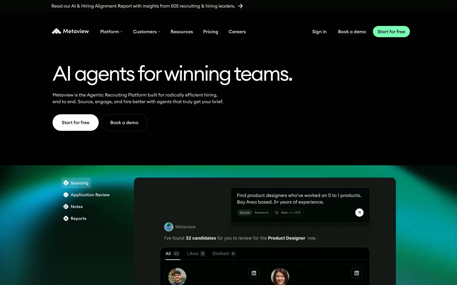
Metaview
Metaview — Style Reference

# Metaview — Style Reference
> Bioluminescent control room — a near-black instrument panel lit by a single living mint signal.
**Theme:** dark
Metaview is a dark-mode AI product surface — a near-black canvas tinted with the faintest green, typed in a geometric neo-grotesque at whisper-light weight, and punctuated by a single vivid mint that acts as a live signal for action and selection. The interface reads like an instrument panel for a recruiting agent: deep, controlled, and precise, with green used sparingly as a switch-on indicator for the primary CTA, active tabs, and a few brand glyphs. Components stay flat and low-elevation; the page gains its depth from a soft radial green bloom behind product mockups, not from drop shadows. Typography is airy and tight-tracked, and the only non-monochrome voice is that electric mint — it is the brand's heartbeat.
## Tokens — Colors
| Name | Value | Token | Role |
|------|-------|-------|------|
| Deep Forest | `#000a06` | `--color-deep-forest` | Page background, hero canvas, footer — near-black with a barely-perceptible green undertone that ties the surface to the mint accent |
| Pine Bark | `#0a1a14` | `--color-pine-bark` | Card and secondary surface background — sits one step above the canvas, used for product mockup containers, nested panels, and dark secondary buttons |
| Charcoal | `#161818` | `--color-charcoal` | Elevated card surface, modals, and overlaid containers — used when a component must visibly float above the Pine Bark layer |
| Abyssal Indigo | `#01051b` | `--color-abyssal-indigo` | Violet accent for outlined action borders, linked labels, and lightweight interactive emphasis. |
Websites
Markdown Text
design-md
website-prompt
landing-page-prompt
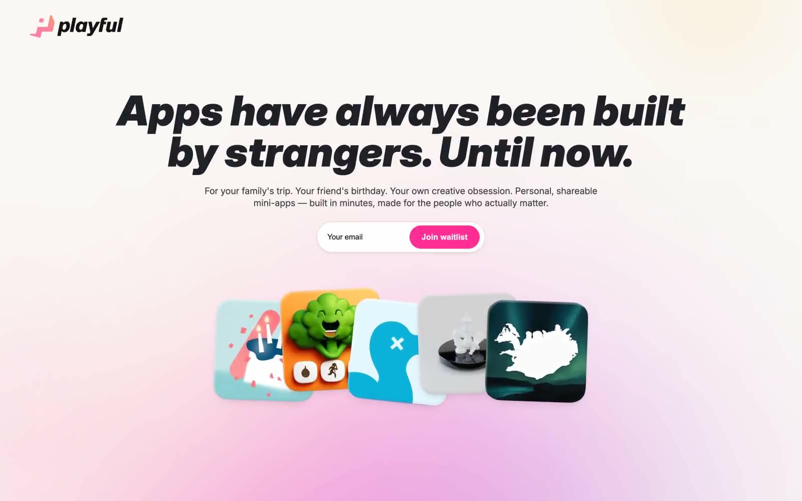
Playful
Playful — Style Reference
# Playful — Style Reference
> sunlit paper notebook with a hot-pink highlighter. A friendly, editorial product surface printed on warm cream stock, where one vivid magenta accent punctuates an otherwise monochrome warm-gray world.
**Theme:** light
Playful reads like a warm, hand-crafted workshop printed on cream paper. The entire surface sits on a sandy oat canvas (#f6f2ee) rather than clinical white, giving every screen a paper-like, approachable warmth. A single hot-pink (#ff2e95) does all the chromatic work — CTAs, links, logo mark — against a near-black ink (#111/#000), so screens stay visually quiet until a moment of action is needed. The display type is unapologetically heavy and italic at 70–79px, leaning into editorial poster energy rather than SaaS neutrality. Components are large and soft: 44px cards on pill-shaped buttons, deep diffused shadows, generous breathing room. The overall rhythm is one bold typographic statement per section, surrounded by quiet warm whitespace.
## Tokens — Colors
| Name | Value | Token | Role |
|------|-------|-------|------|
| Hot Magenta | `#ff2e95` | `--color-hot-magenta` | Primary CTA fill, logo mark, link color, accent strokes — the only chromatic voice in the system, used sparingly to signal action |
| Ink Black | `#000000` | `--color-ink-black` | Primary heading text, button text, heavy borders, navigation bar background |
| Oat Canvas | `#f6f2ee` | `--color-oat-canvas` | Page background, large surface fills — the warm cream that replaces cold white throughout |
| Soft Ink | `#111111` | `--color-soft-ink` | Body text and headings on light surfaces, card surface background for dark elements |
Websites
Markdown Text
design-md
website-prompt
landing-page-prompt
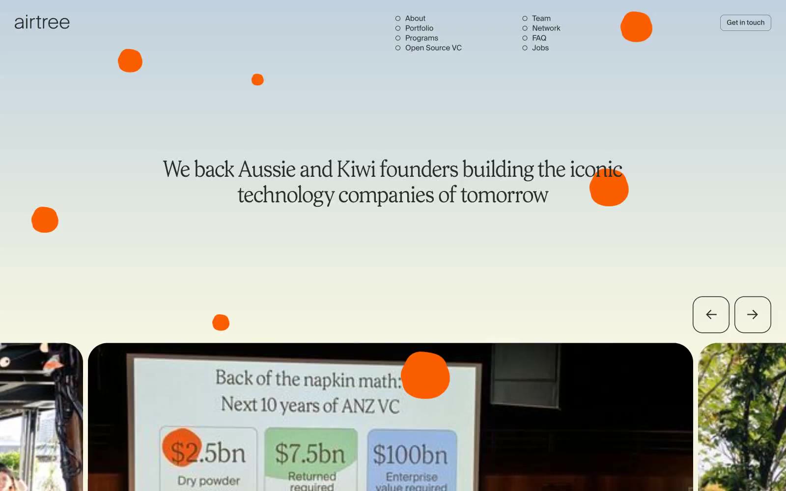
Home
Home — Style Reference
# Home — Style Reference
> Sunlit eucalyptus grove on warm parchment — the design rests on a cream page where ink-black type and a single electric yellow accent do all the talking.
**Theme:** light
Airtree's design language reads as a sunlit editorial spread on warm parchment: a cream canvas (#f7f6e3) carries confident charcoal type, with a single electric yellow accent that punctuates rather than decorates. Prody's oversized display serif at 131px is the brand's loudest voice — everything else is deliberate whitespace and a clean grotesque. Components stay light and paper-like: 37px-rounded cards, outlined ghost controls, pill-shaped yellow CTAs, and hairline borders that define structure without weight. The system avoids heavy elevation, gradients, or saturated color fields; it relies on generous spacing, large radii, and a calm two-tone palette to let photography and quoted founders carry the emotional weight. Color is rationed: a cream page, ink-black type, and one jolt of yellow — no decorative gradients, no multi-hue branding.
## Tokens — Colors
| Name | Value | Token | Role |
|------|-------|-------|------|
| Parchment Cream | `#f7f6e3` | `--color-parchment-cream` | Page canvas, card surfaces, bordered containers — near-gray cream that warms the entire interface and gives the whole site its paper-like calm; Outlined/ghost action borders, pill outlines, and interactive rings that echo the canvas tone — only visible against darker overlays |
| Ink Black | `#262d29` | `--color-ink-black` | Primary text, navigation, body copy, card borders, icon strokes — the only structural color, used for hairline definition and all readable content |
| Electric Lemon | `#ffff48` | `--color-electric-lemon` | Filled CTA buttons, active states, standout badges — a single saturated yellow that breaks the cream/ink calm to signal action; the ratio against #262d29 is 13.2:1 AAA |
Websites
Markdown Text
design-md
website-prompt
landing-page-prompt
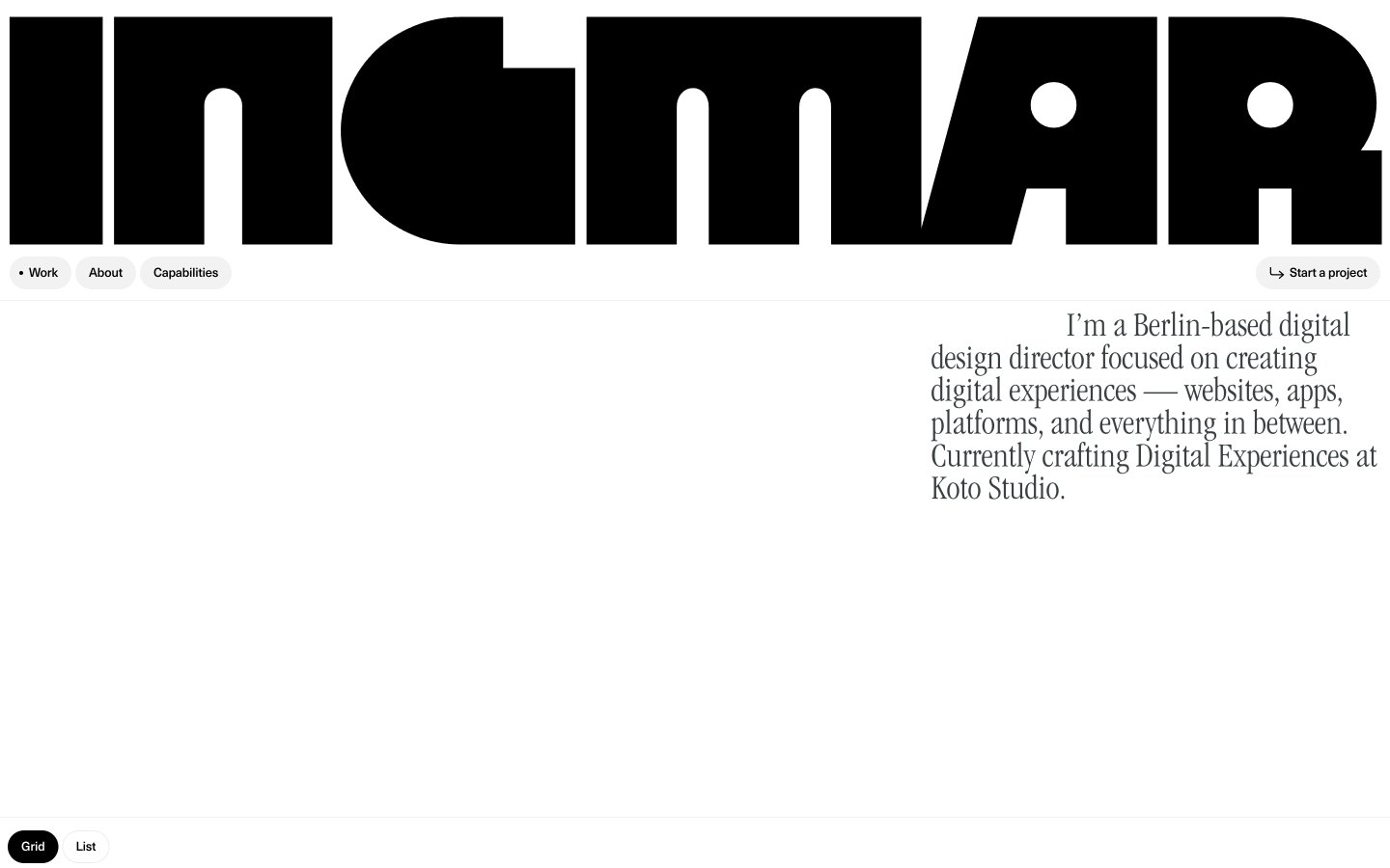
Ingmar Coenen
Ingmar Coenen — Style Reference
# Ingmar Coenen — Style Reference
> Oversized masthead on white paper — a 295px geometric letterform pressed against a vast white wall, with tiny serif footnotes and pill-shaped navigation floating below.
**Theme:** light
Ingmar Coenen's portfolio operates as an editorial gallery wall: a single colossal Megazoid wordmark dominates the top of the page like a magazine masthead, then the system retreats into ruthless white-space and tiny Swiss-type UI. The entire color palette is binary — pure black on pure white with one warm stone-gray for ghost controls — because the work itself is supposed to carry the color. Typography is the brand: a 295px geometric display face (Megazoid) for monumental headings, ITC Garamond Light Condensed for reflective serif body copy, and Neue Haas Unica Pro at 12-13px with negative tracking for all interface chrome. Components are minimal and rounded — 100px pill buttons, 12px cards — creating a tension between the heavy display voice and the soft, almost cartoonish corner radii. Density is compact at the UI level (4-14px gaps) but generous in layout (80-120px section breathing room).
## Tokens — Colors
| Name | Value | Token | Role |
|------|-------|-------|------|
| Pure Black | `#000000` | `--color-pure-black` | Primary text, logo wordmark, filled pill buttons, hairline borders — the structural ink that holds every element together |
| Canvas White | `#ffffff` | `--color-canvas-white` | Page background, card surfaces, button text on dark fills — the paper everything sits on |
| Charcoal Slate | `#3a4042` | `--color-charcoal-slate` | Secondary text, link color, body copy, subtle borders — slightly softened black for hierarchy below the primary text level |
| Pale Stone | `#f2f2f2` | `--color-pale-stone` | Ghost button and segmented toggle background — the only non-white surface, used for inactive controls like the Grid/List switcher |
Websites
Markdown Text
design-md
website-prompt
landing-page-prompt
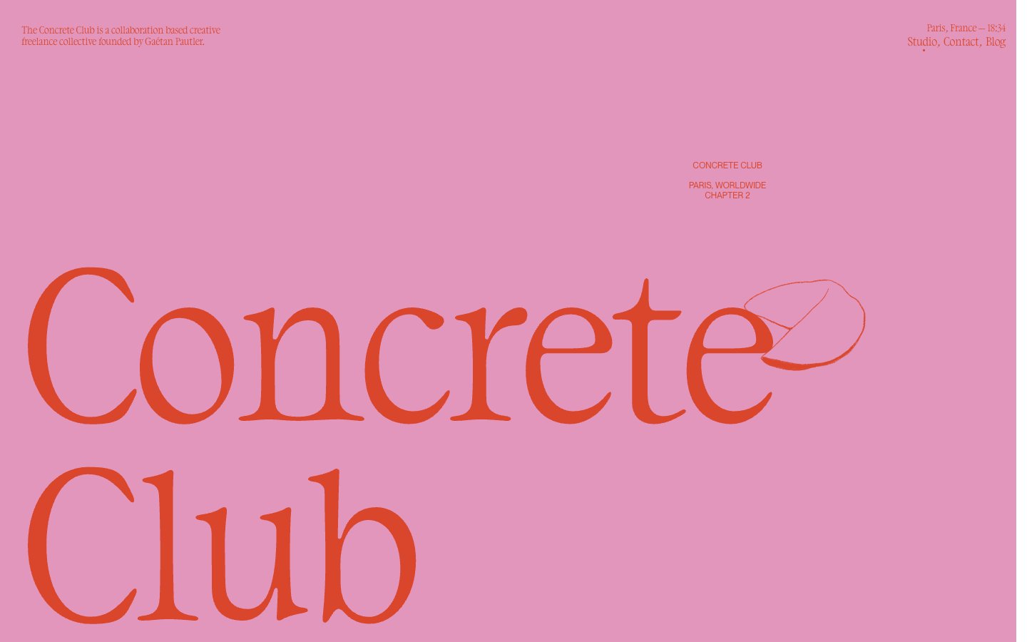
Concrete Club Studio
Concrete Club Studio — Style Reference
# Concrete Club Studio — Style Reference
> sun-faded editorial zine on dusty rose paper — the layout is a printed page, not a screen
**Theme:** mixed
Concrete Club is a warm editorial zine on dusty rose: oversized serif wordmarks dominate generous pink and off-white fields, small uppercase sans-serif tags steer the eye, and single warm orange-red ink bleeds through the layout as the one chromatic accent. Sections alternate between dusty rose, off-white canvas, and deep charcoal — each acts as a separate printed page bound into one publication. Typography is the interface: a distinctive humanist serif (DaVinci) carries all display weight, while Helvetica Neue Light whispers at body and nav scale. Hand-drawn line illustrations interrupt the grid at the right margin of the wordmark, softening the bold typographic authority with lo-fi charm. Everything else is restrained — no buttons, no cards, no shadows — the page behaves like a printed art book, not a software product.
## Tokens — Colors
| Name | Value | Token | Role |
|------|-------|-------|------|
| Ember Ink | `#d9462b` | `--color-ember-ink` | Hero wordmark color, accent strokes, and the only chromatic text — a warm orange-red that reads as hand-pressed ink against the pink field. Used on display headlines and select illustration details |
| Dusty Rose | `#e296bb` | `--color-dusty-rose` | Primary section background — a warm desaturated pink that carries the hero band and full-width content panels. Sets the editorial tone of the site |
| Ink Black | `#000000` | `--color-ink-black` | Primary text, wordmark fill on light sections, illustration linework, and borders. The workhorse neutral |
| Charcoal | `#212121` | `--color-charcoal` | Dark section surface — used for full-bleed panels that invert the page to white-on-black editorial spreads |
Websites
Markdown Text
design-md
website-prompt
landing-page-prompt
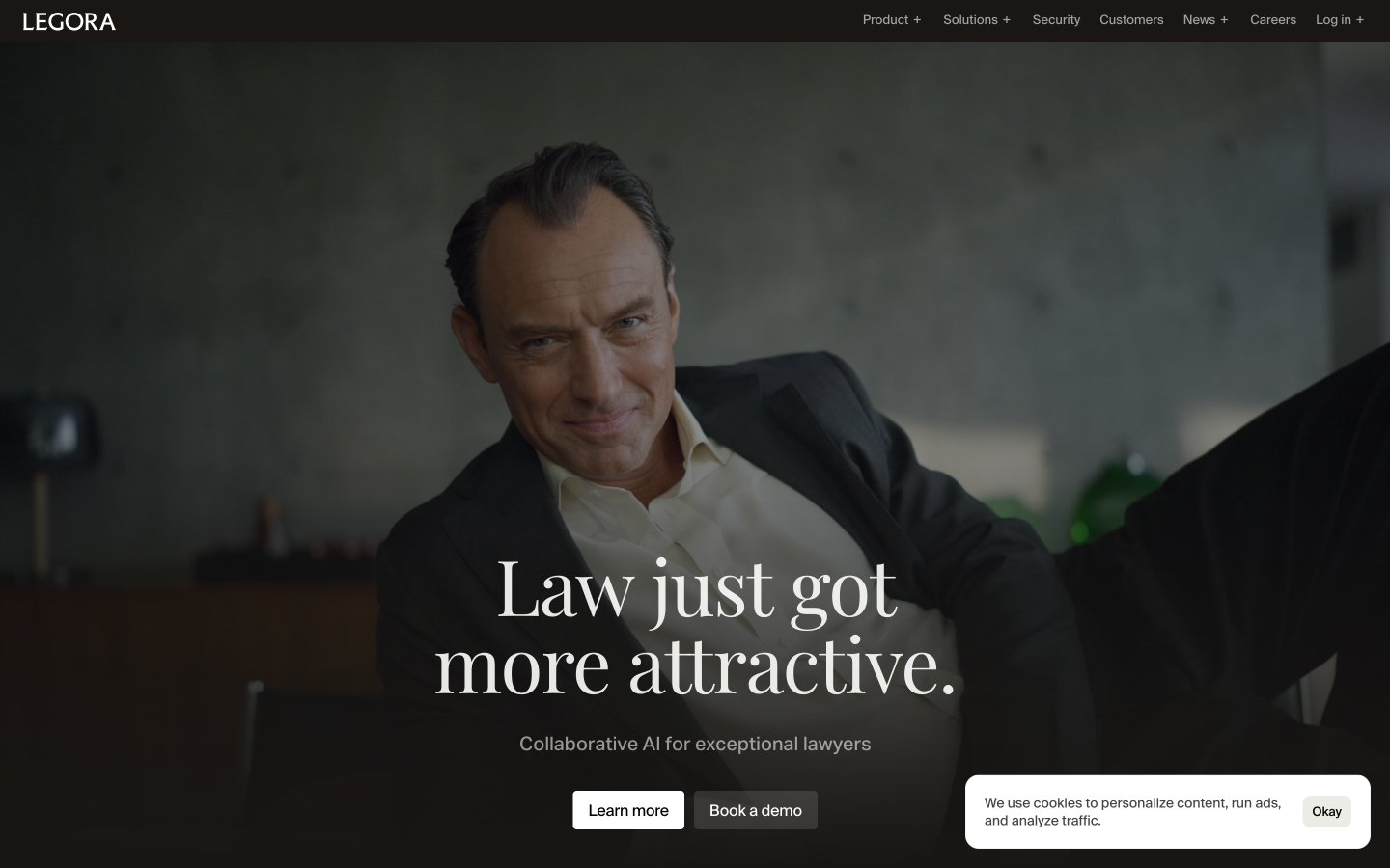
Legora
Legora — Style Reference
# Legora — Style Reference
> Editorial law journal on warm cream
**Theme:** light
Legora reads like an editorial legal journal printed on warm cream paper: a near-monochrome canvas of ivory and ink, whisper-weight serif headlines at 88px, and a body set in a humanist grotesk that feels more like column text than UI copy. The brand signals authority through restraint — no chromatic accents, no decorative gradients, no colored CTAs — instead relying on a single solid-black button as the only piece of high-contrast furniture on otherwise quiet pages. Surfaces are separated by the thinnest possible rules and faint tinted washes (a barely-there sage, a barely-there slate-blue) rather than shadows or elevation. Photography arrives as one cinematic, full-bleed still per page; everything else is typographic and product-screenshot driven, with product surfaces rendered in muted pastel blocks that act as visual breathing room between dense legal copy.
## Tokens — Colors
| Name | Value | Token | Role |
|------|-------|-------|------|
| Parchment | `#fefefc` | `--color-parchment` | Page canvas, card surfaces, light-section backgrounds — a warm ivory that reads as paper, not screen |
| Ink | `#000000` | `--color-ink` | Dark borders and separators for elevated surfaces and inverted UI. Do not promote it to the primary CTA color |
| Graphite | `#0a0a0a` | `--color-graphite` | Body text, heading strokes, dark surface accents — near-black used wherever ink is too harsh |
| Smoke | `#6b6b6b` | `--color-smoke` | Secondary body copy, subdued borders, caption-level metadata |
Websites
Markdown Text
design-md
website-prompt
landing-page-prompt
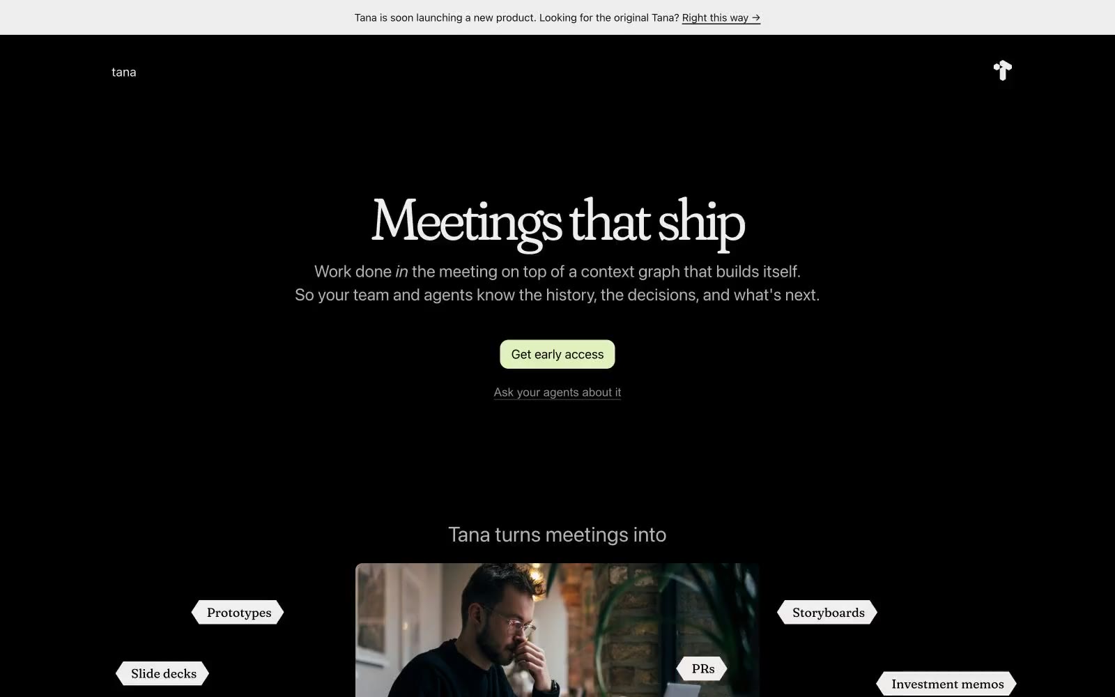
Tana
Tana — Style Reference
# Tana — Style Reference
> Midnight gallery, single lime beacon — a dark editorial spread where one pale-green button is the only color on the entire page.
**Theme:** dark
Tana is a midnight editorial: pure black canvas, one pale-lime signal, nothing else. The entire interface is monochrome — warm off-white type, a quiet scale of grays for hairlines and secondary text — with a single chromatic accent (#e1f0bd) reserved exclusively for the primary action. Headlines come from a custom high-contrast serif (tanaClassic) set tight at negative tracking, which creates a magazine-spread authority against the void. Category labels are pentagon-shaped tags (pointed left edge, flat right) that orbit around imagery like marginalia, turning product features into a printed index. Layout is centered and generous, with editorial photography used sparingly as a single warm focal point in an otherwise typographic page. Everything else is restraint.
## Tokens — Colors
| Name | Value | Token | Role |
|------|-------|-------|------|
| Void | `#000000` | `--color-void` | Page canvas, section backgrounds, card surfaces — pure black, not near-black, makes the off-white type and the lime accent feel luminous |
| Charcoal | `#0e0e0e` | `--color-charcoal` | Elevated surface layer, subtle borders, secondary backgrounds — one step off the void for depth without breaking the dark mode |
| Bone | `#f0eded` | `--color-bone` | Primary text, pentagon tag fills, announcement bar background — slightly warm off-white, softer than pure white against deep black |
| Ash | `#b3b3b3` | `--color-ash` | Secondary body text, muted helper copy, list dividers — the dominant mid-gray for all non-primary prose |
Websites
Markdown Text
design-md
website-prompt
landing-page-prompt
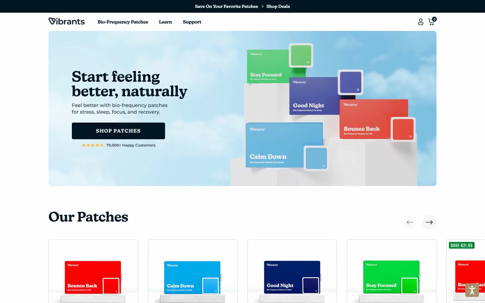
Vibrants
Vibrants — Style Reference
# Vibrants — Style Reference
> Skyborne apothecary on white marble — the dark navy ink is the mortar, the rainbow spectrum is the medicine.
**Theme:** light
Vibrants reads as a bright, clinical wellness counter: white canvas, a deep-navy ink that does the heavy lifting for text and primary buttons, and a full-spectrum rainbow that lives only on the product surface. The visual grammar is deliberately quiet outside the hero and product imagery — almost monochrome structure with a single vivid green punctuating sales, badges, and confirmations. Headlines use a custom serif that leans editorial and trustworthy, while body copy and UI stay in geometric sans-serifs that feel pharmaceutical-precise. Components are flat with hairline borders, soft 8px corners, and minimal elevation; depth comes from color contrast and generous whitespace rather than shadow. The sky-blue gradient hero and floating product mockup set a calm, optimistic tone that the rest of the page sustains through airy spacing and restrained typography.
## Tokens — Colors
| Name | Value | Token | Role |
|------|-------|-------|------|
| Deep Navy | `#021422` | `--color-deep-navy` | Primary text, primary filled buttons, nav backgrounds, heading ink, footer surface — near-black that reads as ink rather than pure black, grounding the page while staying soft enough to pair with white |
| Vibrant Green | `#00852e` | `--color-vibrant-green` | Sale badges, discount pills, success indicators, single-use accents — the only vivid hue that touches the chrome; every other chromatic surface belongs to a product |
| Midnight Navy | `#001f38` | `--color-midnight-navy` | Secondary text emphasis, card border accent on hero product, heading hierarchy step below Deep Navy — slightly bluer for tonal variation without leaving the family |
| Sky Wash | `#91c3ff` | `--color-sky-wash` | Outlined button borders, icon accents, link highlights — light blue that whispers rather than shouts, used for ghost controls that still need chromatic definition |
Websites
Markdown Text
design-md
website-prompt
landing-page-prompt
Convex
Convex — Style Reference
# Convex — Style Reference
> Cream paper engineering notebook
**Theme:** mixed
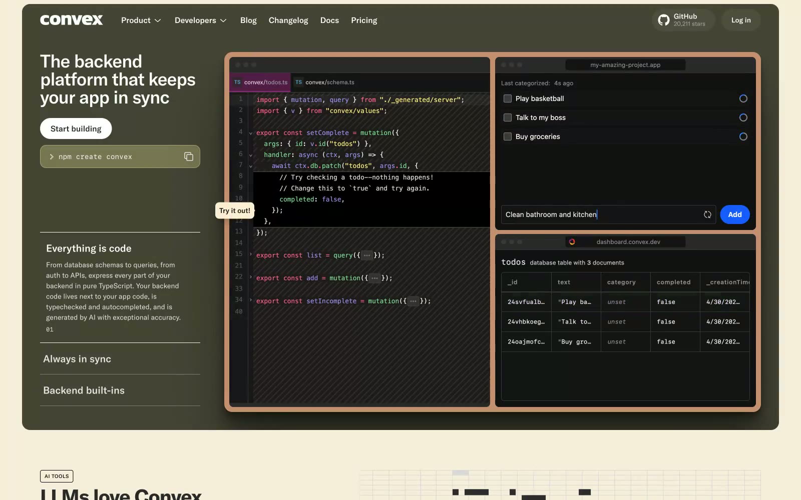
Convex presents a warm cream-paper technical workspace: a desaturated beige canvas (#f6f6f6 to #f7f1ff) hosts both product UI and product screenshots, while dark code surfaces (#141414, #292929) carry TypeScript and dashboard previews with syntax-highlight punctuation in pink, violet, green, and yellow. GT America grotesque at whisper-weights creates a calm, editorial engineering voice — tight negative tracking on 40-56px headlines compresses the wordmark into confident, compact blocks. Components are squared and compact: 8-12px radii, thin charcoal borders, and minimal padding produce a blueprint-like density that reads more like a developer's notebook than a marketing site.
## Tokens — Colors
| Name | Value | Token | Role |
|------|-------|-------|------|
| Ink Black | `#141414` | `--color-ink-black` | Primary text, dark card surfaces, code editor backgrounds, filled neutral buttons — the dominant dark across the site |
| Paper White | `#ffffff` | `--color-paper-white` | Light supporting surface for subtle backgrounds and section separation. Do not promote it to the primary CTA color |
| Cream Surface | `#f6f6f6` | `--color-cream-surface` | Page canvas and section backgrounds — warm off-white that distinguishes Convex from cold-white SaaS |
| Lilac Wash | `#f7f1ff` | `--color-lilac-wash` | Subtle tinted background panels, icon wash areas, soft section dividers |
Websites
Markdown Text
design-md
website-prompt
landing-page-prompt
San Rita
San Rita — Style Reference
# San Rita — Style Reference
> alpine field guide on sage paper
**Theme:** mixed
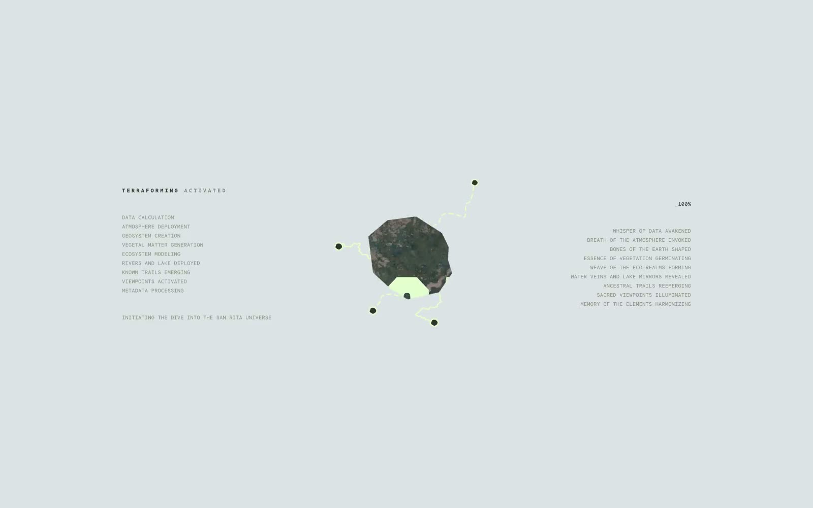
San Rita reads like a field journal for an outdoor boot brand: expansive landscape photography, a single pale mint accent that pops like highlighter on topo paper, and a custom condensed display face that turns section openers into landscape-blocking statements. The visual rhythm alternates between bright, full-bleed imagery and near-black (#161b13) dark bands where tilted Polaroid-style photos scatter across the canvas like a fly-fishing logbook. Typography is utilitarian and small for everything except the display moments — mono caps handle UI chrome while a single massive 300px+ display line carries each section's identity. Components stay flat and unembellished: thin outlined buttons, no shadows, no rounded corners to soften the edges. The whole system feels like topographic map meets adventure zine — confident, outdoorsy, and deliberately raw rather than polished SaaS.
## Tokens — Colors
| Name | Value | Token | Role |
|------|-------|-------|------|
| Highlighter Mint | `#e2ffcc` | `--color-highlighter-mint` | Primary brand accent — display text, nav links, button labels, icon fills. The signature color; reads as highlighter pen on topo map |
| Sage Stone | `#84907f` | `--color-sage-stone` | Muted secondary accent — subtle background washes, subdued UI elements where Highlighter Mint would be too loud |
| Carbon Ink | `#161b13` | `--color-carbon-ink` | Dark section backgrounds — near-black with the faintest green undertone, anchors the dark bands of the page |
| Forest Charcoal | `#2d3329` | `--color-forest-charcoal` | Mid-dark text and borders on light sections — softer than pure black, keeps the green-warmth consistent |
Websites
Markdown Text
design-md
website-prompt
landing-page-prompt
Analogue
Analogue — Style Reference
# Analogue — Style Reference
> Light tunnel through void
**Theme:** dark
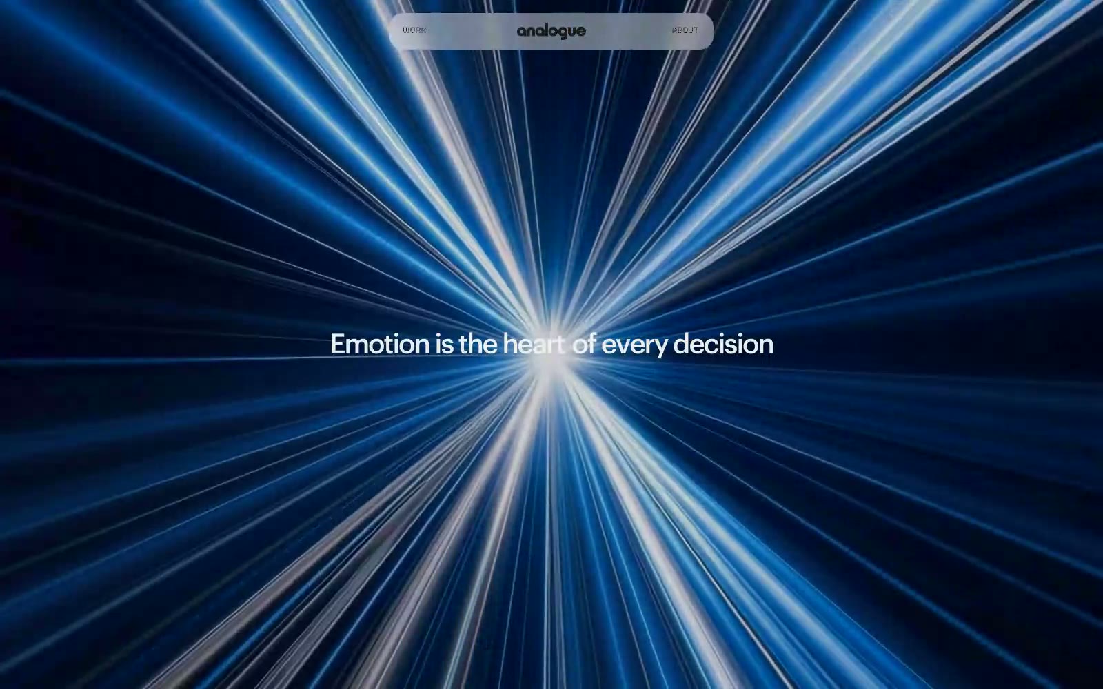
Analogue operates as a cinematic void with a single luminous focal point: white type against near-black depth, interrupted only by a blue-white photographic light burst. The system is strictly achromatic — no chromatic accents, no shadows, no decorative gradients — so every emotional beat must come from typography, photography, and negative space. Type sits at a compressed 11–18px body register with whisper-tight tracking (-0.05em at display) and cinematically tight line-heights (1.00–1.05 on 40–60px display), making headlines feel like film titles rather than web headings. The LCD dot font appears as a single rare accent — digital punctuation in an otherwise humanist system. Navigation is a floating translucent pill, buttons are achromatic outlines or ghosts, and the architecture of the page (borders, surfaces, dividers) is so flat it disappears, forcing the photography and the type to do all the work.
## Tokens — Colors
| Name | Value | Token | Role |
|------|-------|-------|------|
| Ink | `#000000` | `--color-ink` | Pure black — the structural anchor, used for hairlines, border strokes, and the deepest surface layer beneath imagery |
| Graphite | `#1c1c1c` | `--color-graphite` | Primary text and dominant UI foreground — body copy, headings, and the off-black tone that softens pure black for large runs of type |
| Paper | `#ffffff` | `--color-paper` | Primary page canvas and white card surfaces. |
| Mist | `#ededed` | `--color-mist` | Subtle surface wash for cards and elevated panels — the gentlest step off Paper, used where a panel needs to register without shouting |
Websites
Markdown Text
design-md
website-prompt
landing-page-prompt
Valo
Valo — Style Reference
# Valo — Style Reference
> noir observatory at midnight — weight-300 typography floats on pure black while a single teal-violet gradient passes through like a laser line across the room.
**Theme:** dark
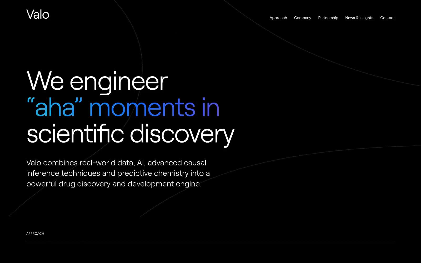
Valo runs on a noir observatory aesthetic: deep-black canvas, a single custom serif-less voice at whisper weight (300), and one luminous blue-teal-violet gradient used as deliberate punctuation rather than decoration. Typography does the heavy lifting — 100px display headlines with tight negative tracking feel like illuminated ink on obsidian, while the rest of the interface stays nearly invisible. The gradient appears in exactly three roles: a single accent word inside a headline, a thin floating ring/torus visual, and a wash at the page foot — never as a button fill or panel background. Components are flat, hairline-bordered, and borderless where possible; interaction is signaled by circular arrow buttons and numbered sequencing, not by color or shadow. Every screen should feel like a page torn from a dark scientific monograph: quiet, confident, with one moment of light.
## Tokens — Colors
| Name | Value | Token | Role |
|------|-------|-------|------|
| Void | `#000000` | `--color-void` | Page canvas, hero background, all primary surface area. Sets the dark-stage tone for every screen |
| Bone | `#e5e7eb` | `--color-bone` | Hairline borders, dividers, and muted secondary text. The workhorse neutral that defines edges without adding visual weight |
| Paper | `#ffffff` | `--color-paper` | Primary headings, body text, nav links, and icon strokes. Maximum contrast against Void for clear information hierarchy |
| Graphite | `#4d4d4d` | `--color-graphite` | Subtle nav borders and disabled/inactive state lines. Sits between Void and Bone for low-emphasis structural lines |

Websites
Markdown Text
design-md
website-prompt
landing-page-prompt
Arcade
Arcade — Style Reference
# Arcade — Style Reference
> Electric blue ripple on white paper. A clean editorial canvas where a single vivid blue flows like liquid from corner to corner, making every interactive element feel switched on.
**Theme:** light
Arcade's visual system is a white-canvas product surface accented by one saturated electric-blue (#2142e7) and a signature flowing blue gradient that anchors the hero. Typography is Inter across all sizes, with weight concentrated in the 400–700 band and tight negative tracking on display sizes that tightens the type optically as it scales. The interface reads as functional and quiet: gray-on-white content blocks, thin borders, compact 12–16px radii, and cool-tinted shadows built on rgba(17,24,39,...) that keep every elevated surface feeling on-brand. Color is rationed — one blue does the work of accent, CTA, and focus — while everything else is a neutral ramp. Density is comfortable but not airy: 8px and 12px gaps dominate micro-spacing, 32–48px separates sections.
## Tokens — Colors
| Name | Value | Token | Role |
|------|-------|-------|------|
| Voltage Blue | `#2142e7` | `--color-voltage-blue` | Violet supporting accent for decorative details and low-frequency emphasis. Do not promote it to the primary CTA color |
| Deep Voltage | `#182fa5` | `--color-deep-voltage` | Violet supporting accent for decorative details and low-frequency emphasis. Do not promote it to the primary CTA color |
| Midnight Ink | `#111827` | `--color-midnight-ink` | Supporting neutral for secondary UI, dividers, and muted labels. Do not promote it to the primary CTA color |
| Slate 600 | `#4b5563` | `--color-slate-600` | Body text, nav links, icon fills, card secondary copy — the dominant text color across the page |
Websites
Markdown Text
design-md
website-prompt
landing-page-prompt
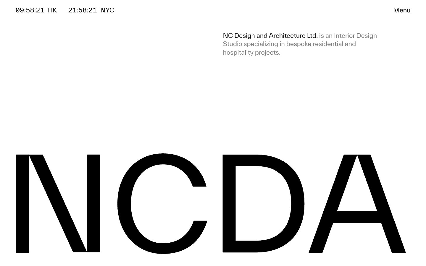
NCDA
NCDA — Style Reference
# NCDA — Style Reference
> Architectural monograph in negative space. The NCDA wordmark at 62px is cropped by the viewport edge, turning a logo into a wall.
**Theme:** mixed
NCDA operates as a printed monograph translated to the web: paper-white canvas, a single near-black ink, zero chromatic noise, and type that does the structural work that color usually does. The signature move is the wordmark itself — rendered at architectural scale and cropped by the viewport edge, it turns the brand mark into a layout device rather than a logo. Navigation is reduced to essentials: a live dual-city clock in the corner, a single 'Menu' trigger, and a tight gray description block. The system alternates between vast white negative space and occasional full-bleed black bands, creating an exhibition-catalogue rhythm. Components are sparse and unornamented — no shadows, no rounded corners, no buttons — just hairline rules, generous margins, and type that whispers through tight negative tracking at display sizes and slightly positive tracking at caption sizes.
## Tokens — Colors
| Name | Value | Token | Role |
|------|-------|-------|------|
| Onyx | `#191919` | `--color-onyx` | Primary text, hairline borders, full-bleed dark surface bands — the near-black ink of the system |
| Pure Black | `#000000` | `--color-pure-black` | Secondary text fills, deepest borders, and image overlays where maximum contrast against white is required |
| Paper | `#ffffff` | `--color-paper` | Page canvas, surface backgrounds, inverse text on dark bands |
| Concrete | `#808080` | `--color-concrete` | Secondary descriptive text, muted link borders, subdued meta-information — the gray of footnotes and captions |
Websites
Markdown Text
design-md
website-prompt
landing-page-prompt
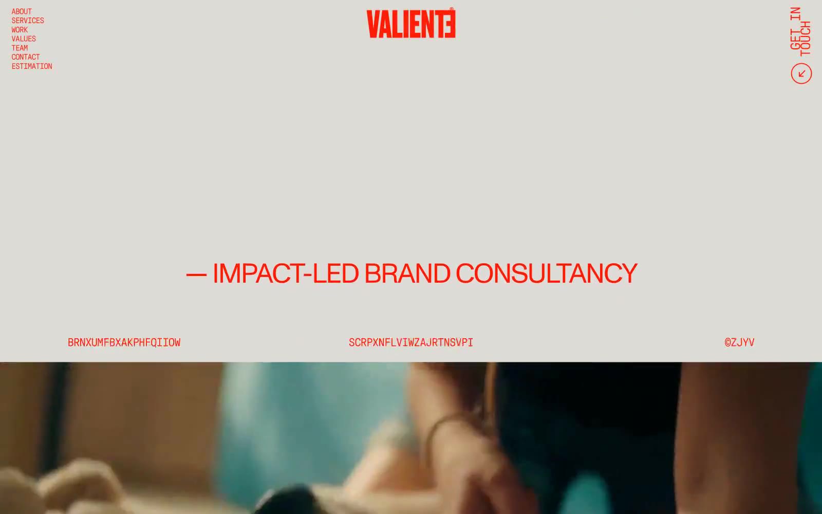
VALIENTE BRANDS
VALIENTE BRANDS — Style Reference
# VALIENTE BRANDS — Style Reference
> Signal flare on sun-baked clay. A single urgent red-orange screaming across a warm matte peach field, held together by a monolithic neo-grotesque and almost nothing else.
**Theme:** light
Valiente Brands is a brutalist broadcast — a single chromatic signal (vivid red-orange) fired across a sun-warmed clay canvas, with almost no UI surface treatment at all. The page is a vertical scroll of oversized monospace-feeling type, corner-pinned navigation labels, full-bleed cinematic video stills, and portrait grids. The aesthetic borrows from emergency signage and typesetter's proof sheets: everything is uppercase, aggressively tracked-negative at display sizes, and stripped of decoration. There are no cards, no shadows, no gradients, no rounded corners — the whole interface reads like a single printed broadside where one color does all the work. White space and type scale do the hierarchy, not containers or elevation.
## Tokens — Colors
| Name | Value | Token | Role |
|------|-------|-------|------|
| Signal Flare | `#ff1a00` | `--color-signal-flare` | The only chromatic color in the system — used for logo, all navigation, body text, headings, icons, borders, and the video play affordance. Functions as both brand mark and foreground text color simultaneously |
| Sun-Baked Canvas | `#e7a196` | `--color-sun-baked-canvas` | Page background — a warm, muted clay-peach that softens the intensity of the red and gives the whole site its heat-shimmer atmosphere. Every default surface sits on this tone |
| Midnight Frame | `#0a0a0a` | `--color-midnight-frame` | Reserved for full-bleed video and photography sections only — appears as the dark frame around embedded media, never as a UI surface or text color |
Websites
Markdown Text
design-md
website-prompt
landing-page-prompt
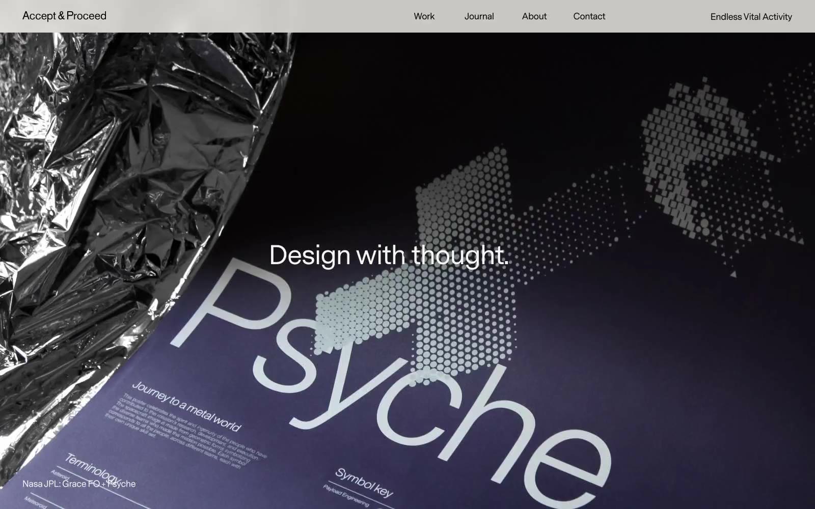
Acceptandproceed
Acceptandproceed — Style Reference
# Acceptandproceed — Style Reference
> editorial broadsheet on warm paper
**Theme:** light
Accept & Proceed treats the browser as an editorial broadsheet: a single-weight sans-serif at nine sizes, a warm cream canvas, and an almost completely achromatic palette let photography and layout do the expressive work. Hierarchy is built from scale alone — weight 400 is used for everything from 8px captions to 72px display, so contrast comes from size jumps, not boldness. Surfaces are paper-warm: #f9f7f3 is the page, #ecebe7 the button fill, and the only structural chrome is a hairline 1px black border. Components are deliberately quiet — pill buttons at 100px radius, small badges with a 3.4px corner, 8px card radius — so the project imagery and long-form editorial content carry the page. The system feels like flipping through a thoughtfully typeset design annual rather than scrolling a SaaS dashboard.
## Tokens — Colors
| Name | Value | Token | Role |
|------|-------|-------|------|
| Ink | `#000000` | `--color-ink` | Primary text, hairline borders, icon strokes, badge outlines, card outlines — the only structural line color in the system |
| Paper Warm | `#f9f7f3` | `--color-paper-warm` | Page canvas, card surfaces, body backgrounds — the warm cream base layer for all content |
| Bone | `#ecebe7` | `--color-bone` | Raised surfaces, pill button fills, input fills, link backgrounds — one step warmer/darker than the canvas for tactile depth without shadows |
| White | `#ffffff` | `--color-white` | Headline color on dark hero overlays, card highlight wash, inverted surface accents |
Websites
Markdown Text
design-md
website-prompt
landing-page-prompt
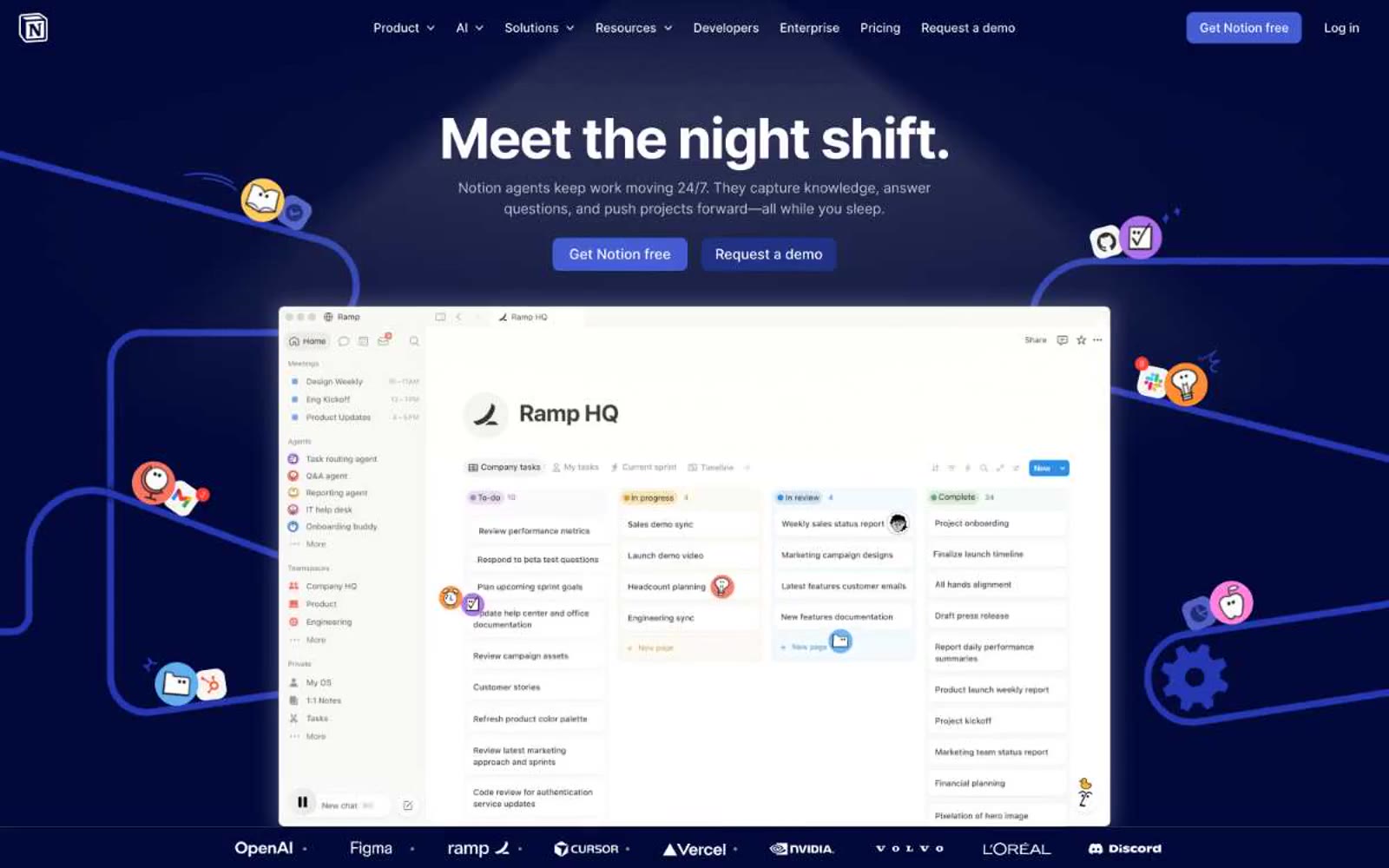
Notion
Notion — Style Reference
# Notion — Style Reference
> midnight workspace, warm paper below
**Theme:** mixed
Notion operates as a midnight workspace that hands you the keys to a clean editorial room. The first screen is a deep navy stage (#02093a) where a single bold headline commands attention, surrounded by subtle violet glows and product screenshots that float like objects under glass. Below the fold, the page lightens into a warm white editorial canvas (#f6f5f4) where product cards, testimonials, and feature blocks read like a well-designed magazine spread. Typography carries the personality: NotionInter does the utilitarian work at compact confident sizes, while Lyon Text appears as occasional editorial accent — a serif whisper that signals 'this is thoughtful, not just functional.' The color system is mostly cool blue and violet for the dark surfaces, with the brand's identity expressed through the midnight canvas itself rather than a single bright accent — a deliberate inversion of the typical SaaS color hierarchy.
## Tokens — Colors
| Name | Value | Token | Role |
|------|-------|-------|------|
| Midnight Ink | `#02093a` | `--color-midnight-ink` | Hero canvas, top-of-page surface, and the brand's defining dark stage — deep navy reads as serious, focused, almost like an editor's darkroom before the content lights up |
| Signal Blue | `#0075de` | `--color-signal-blue` | Primary action buttons, filled CTA backgrounds, active link emphasis — the one bright blue that makes actions feel switched on against the midnight canvas |
| Sky Tint | `#62aef0` | `--color-sky-tint` | Decorative gradient stops, illustrated icon accents, soft highlight washes around headlines and product mockups — light blue provides the air around the heavy midnight |
| Royal Violet | `#2537b1` | `--color-royal-violet` | Decorative gradient accent, illustrated aura around product screenshots, secondary brand surface in dark mode navigation |
Websites
Markdown Text
design-md
website-prompt
landing-page-prompt
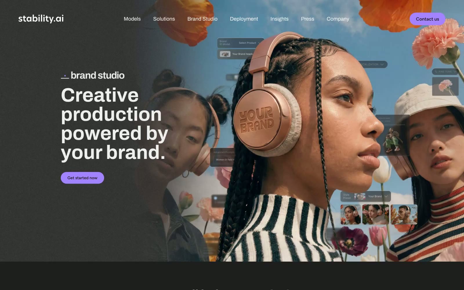
Stability AI
Stability AI — Style Reference
# Stability AI — Style Reference
> Lavender pulse in a darkroom. Full-bleed editorial photography floats over near-black surfaces, with a single vivid violet accent that electrifies every interactive element without ever shouting.
**Theme:** dark
Stability AI is a dark-canvas creative platform with a single electric lavender accent cutting through near-black surfaces. Full-bleed editorial photography dominates the hero, with floating product UI composited over models and flora to fuse tool and output into one image. Typography is Archivo in confident weights, with display sizes tightened at low line-heights (≈0.98–1.07) so headlines stack as compact editorial blocks rather than airy marketing copy. Interaction is signaled almost entirely by the violet pulse — pill-shaped CTAs, underlined links, arrow affordances, and even footer social icons all read as the same lavender frequency. Surfaces layer subtly (#1e1e1 → #383838 → #000000) with zero decorative shadow, so depth comes from tonal shifts and generous negative space rather than elevation. Components are lightweight and confident: pill buttons, thin dividers, and muted-violet body text (#725d91) that recedes while keeping the page tonally unified.
## Tokens — Colors
| Name | Value | Token | Role |
|------|-------|-------|------|
| Iris Spark | `#a381ff` | `--color-iris-spark` | Violet supporting accent for decorative details and low-frequency emphasis. Do not promote it to the primary CTA color |
| Indigo Edge | `#776cff` | `--color-indigo-edge` | Violet supporting accent for decorative details and low-frequency emphasis. Do not promote it to the primary CTA color |
| Mauve Veil | `#725d91` | `--color-mauve-veil` | Headings, body text on dark, and muted link text — a desaturated violet that keeps the page tonally unified with the accent while letting content recede |
| Lilac Ash | `#b6a9c6` | `--color-lilac-ash` | Secondary body copy, helper text, subtle link variants on dark — the lightest purple-tinted neutral, bridging the gap between mauve headings and white labels |
Websites
Markdown Text
design-md
website-prompt
landing-page-prompt
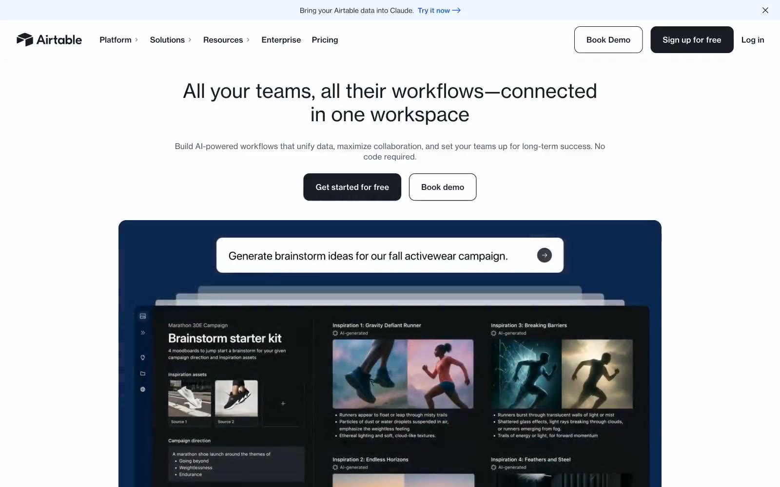
Airtable
Airtable — Style Reference
# Airtable — Style Reference
> warm workshop with color-coded chapters
**Theme:** light
Airtable presents as a warm, editorial workspace rather than a cold SaaS dashboard. The canvas is a soft cream parchment (#faf5e8) — never stark white — which gives the whole site a paper-like, almost printed feel. Typography is bold and unapologetic: a custom display face at near-900 weight for hero headlines pairs with a workhorse sans for body and UI. Buttons are pure black, not the expected brand-blue, giving the page an architectural, almost print-publication confidence. The signature move is color-coded feature cards — each use case gets its own saturated hue (terracotta, deep blue, forest green, peach, pink) functioning as chapter dividers in a visual catalog. The overall effect is a creative studio notebook: warm, organized, opinionated, and human.
## Tokens — Colors
| Name | Value | Token | Role |
|------|-------|-------|------|
| Parchment Cream | `#faf5e8` | `--color-parchment-cream` | Page canvas — the warm off-white that defines the entire site's atmosphere, replacing standard pure-white backgrounds |
| Pure White | `#ffffff` | `--color-pure-white` | Light supporting surface for subtle backgrounds and section separation. Do not promote it to the primary CTA color |
| Frost White | `#f8fafc` | `--color-frost-white` | Alternate light surface for nested elements, subtle nav backgrounds |
| Onyx | `#181d26` | `--color-onyx` | Supporting neutral for secondary UI, dividers, and muted labels. Do not promote it to the primary CTA color |
Websites
Markdown Text
design-md
website-prompt
landing-page-prompt
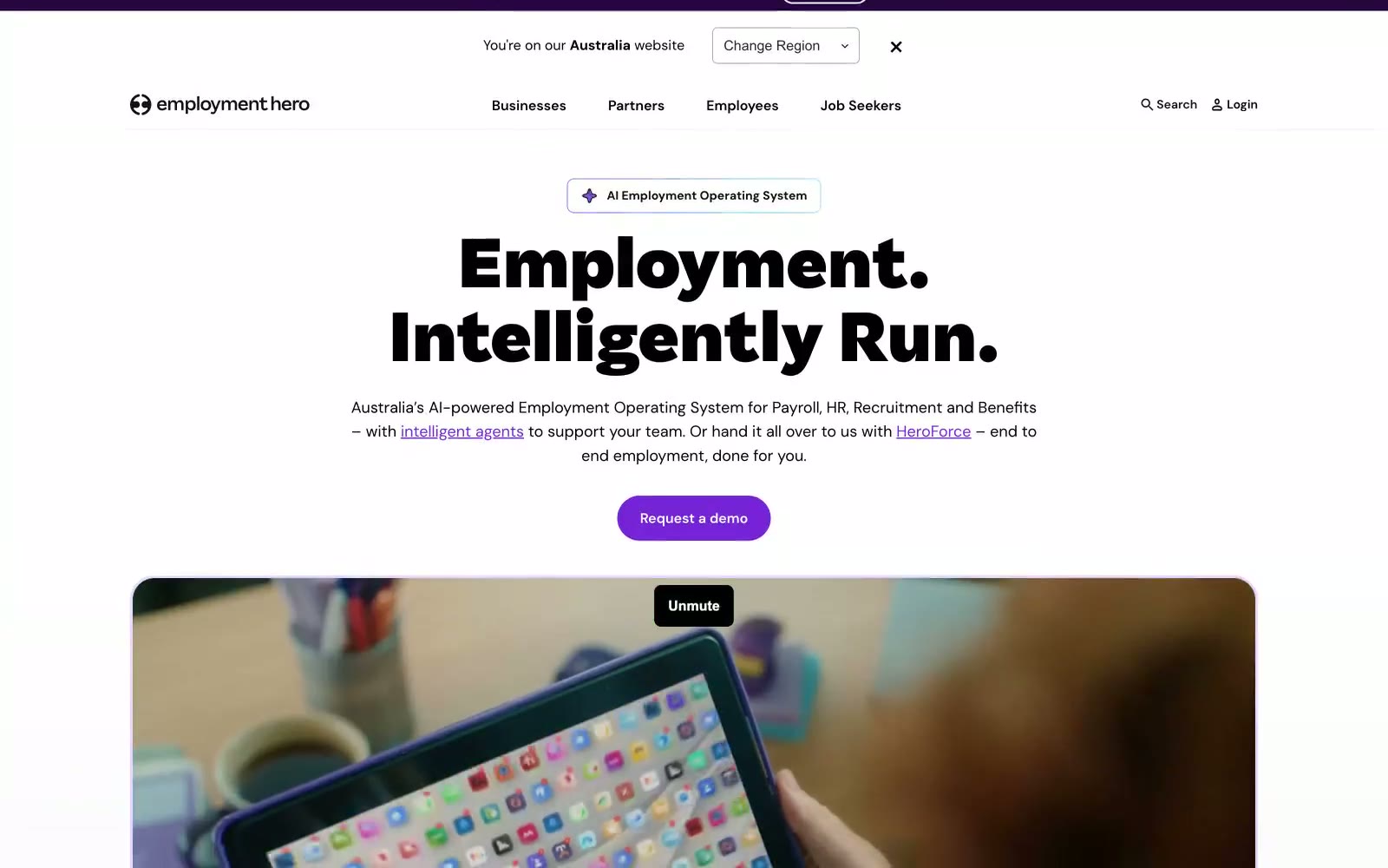
Employment Hero
Employment Hero — Style Reference
# Employment Hero — Style Reference
> violet ink on white parchment
**Theme:** light
Employment Hero projects a confident, AI-forward HR platform identity built on extreme typographic weight contrast: Saiga at 800–1000 weight delivers near-black display headlines that dominate white canvases, while DM Sans at 400–500 keeps interface text light and approachable. The visual system is anchored by a single vivid violet (#7622d7) that appears as compact filled pills, thin borders, and icon strokes — never as broad color washes — creating a 'punctuation' effect where color marks intent rather than fills space. Surfaces layer in three violet-tinted steps (#ffffff → #f9f5ff → #f0e6fa) giving the impression of a very pale lavender atmosphere without ever feeling decorative. Components are deliberately geometric: 32px pill buttons, 8–12px card corners, generous 16–24px padding, and 1px hairline borders over soft backgrounds — the result feels like a precise technical document that learned to wear soft clothing.
## Tokens — Colors
| Name | Value | Token | Role |
|------|-------|-------|------|
| Hero Violet | `#7622d7` | `--color-hero-violet` | Primary action fills, active nav, link text, icon strokes, key borders — concentrated violet that signals interactivity and energy against the achromatic canvas |
| Lavender Wash | `#f9f5ff` | `--color-lavender-wash` | Soft section backgrounds, card fills, hover surfaces — barely-there violet tint that creates atmospheric depth without committing to color |
| Lilac Bloom | `#f0e6fa` | `--color-lilac-bloom` | Slightly stronger lavender for tagged surfaces, highlighted cards, badge backgrounds |
| Periwinkle Veil | `#e6d5fe` | `--color-periwinkle-veil` | Outlined action borders, soft decorative borders, glow/shadow tints — a mid-violet for quieter emphasis |
Websites
Markdown Text
design-md
website-prompt
landing-page-prompt
Control
Control — Style Reference
# Control — Style Reference
> Editorial Swiss grid meets creative tool
**Theme:** light
Control operates as an editorial design tool: white canvas, hard black borders, and a near-monochrome palette punctured by vivid green, orange, and yellow accents that feel like editorial highlighter marks. The signature is a brutalist typographic contrast — massive Melange display type (71–146px) at near-zero tracking set against tiny uppercase Favorit Mono labels (9–10px) with tight negative letter-spacing. Every surface is flat; depth comes from black border outlines (1–2px), not shadows. The aesthetic reads like a Swiss editorial spread rebuilt for software: grid-anchored, unapologetically geometric, and confident in its asymmetry.
## Tokens — Colors
| Name | Value | Token | Role |
|------|-------|-------|------|
| Obsidian | `#000000` | `--color-obsidian` | Primary text, structural borders, and outline contours that define all surface edges |
| Paper | `#ffffff` | `--color-paper` | Page canvas, inverted text on dark surfaces, and button labels on green fills |
| Gridline | `#d2d2d2` | `--color-gridline` | Subtle dividers and light borders on secondary surfaces |
| Slate | `#3d3d3d` | `--color-slate` | Secondary text and muted UI elements |
Websites
Markdown Text
design-md
website-prompt
landing-page-prompt
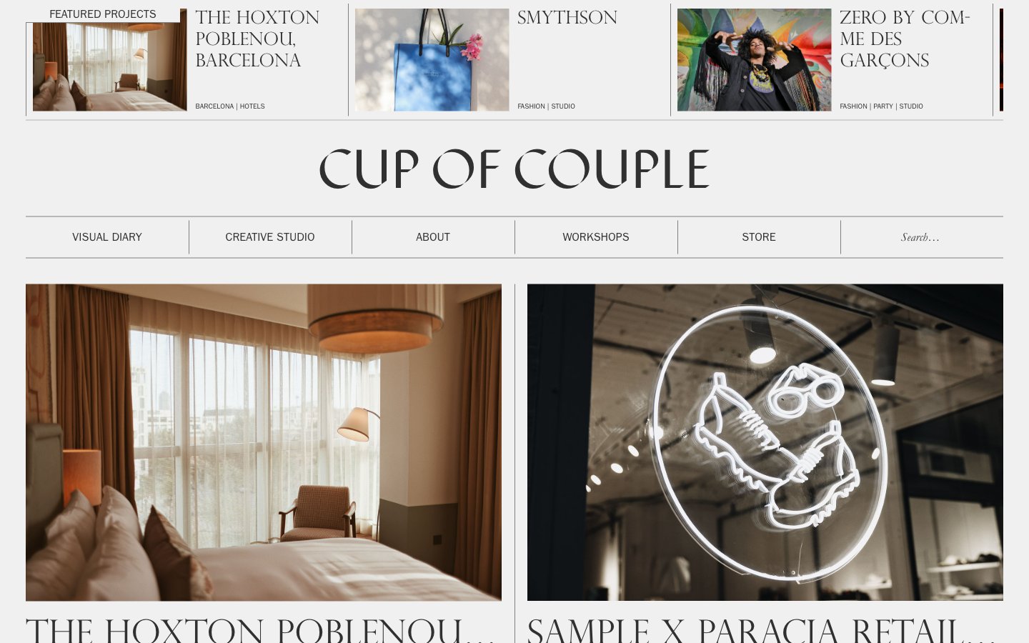
Cup of Couple
Cup of Couple — Style Reference
# Cup of Couple — Style Reference
> printed fashion magazine on cream paper
**Theme:** light
Cup of Couple operates as an editorial visual diary: a near-monochrome canvas with warm photography doing all the chromatic work. Every interface element is weight 400 — no bold weights exist in the system, so hierarchy is built through typeface choice (a humanist sans, a classical serif, a titling serif) rather than through thickness. The result reads like a printed magazine spread that happens to scroll: large serif titles, hairline gray rules, generous whitespace, and a gridded portfolio of lifestyle imagery. Brand identity lives almost entirely in one custom display face for the wordmark and the discipline of never adding color to chrome.
## Tokens — Colors
| Name | Value | Token | Role |
|------|-------|-------|------|
| Ink Charcoal | `#303030` | `--color-ink-charcoal` | Primary text, all UI borders, nav rules, image borders — the only non-white structural color in the system. The brand's deliberate refusal to go pure black gives headlines a softer, printed feel |
| Dust Gray | `#808080` | `--color-dust-gray` | Secondary borders, card dividers, footer rules, tertiary UI separators — a mid-gray that recedes behind content and never competes with photography |
| Bone | `#f0f0f0` | `--color-bone` | Card surfaces, subtle elevation against the white page, light shadow tints — warms the page away from clinical white and echoes paper stock |
| Faded Pencil | `#767676` | `--color-faded-pencil` | Rare nav underline / accent rule — used sparingly where a separator needs slightly more presence than Dust Gray |
Websites
Markdown Text
design-md
website-prompt
landing-page-prompt
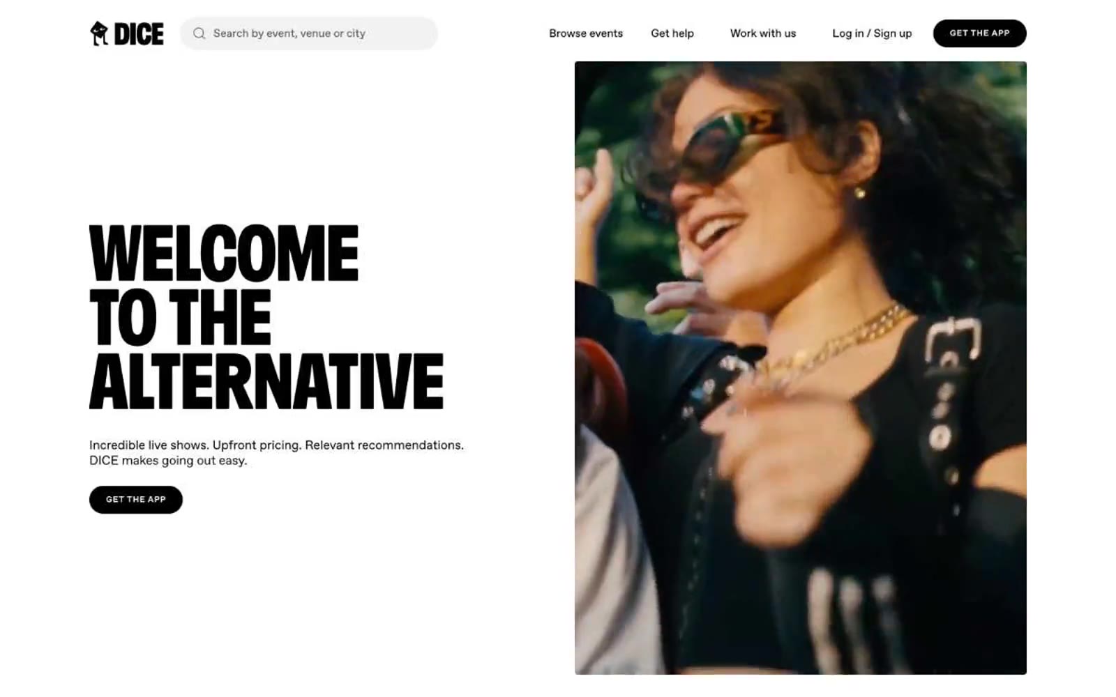
DICE
DICE — Style Reference
# DICE — Style Reference
> Monochrome gig flyer — black ink on white paper, headlines screaming, everything else dead quiet.
**Theme:** light
DICE runs on a strictly monochromatic, high-contrast visual system that reads like a concert poster forced into an app store. Pure black and white carry the entire interface; color exists only inside the artwork of event posters and one neon-green confirmation screen. A custom condensed display face (Foggy) shouts at 100px+ in the hero, while Favorit handles every UI surface with a slightly loosened 0.06em tracking that makes even body copy feel editorial. Buttons are 40px-radius pills, images sit in soft 8px-rounded frames, and sections alternate between white canvas and full-bleed black bands to create a zine-like rhythm. The overall attitude is punk, confident, and typographically loud — restraint everywhere except the headlines.
## Tokens — Colors
| Name | Value | Token | Role |
|------|-------|-------|------|
| Pitch Black | `#000000` | `--color-pitch-black` | Primary text, filled pill buttons, full-bleed dark section backgrounds, icon strokes, hairline borders — the structural backbone of every page |
| Paper White | `#ffffff` | `--color-paper-white` | Page canvas, card surfaces, text on dark sections, button text on filled black buttons, search field fill |
| Ash Gray | `#eeeeee` | `--color-ash-gray` | Soft image backgrounds, secondary surface tint, subtle card/poster fill behind event artwork |
| Concrete | `#d9d9d9` | `--color-concrete` | Hairline dividers, muted borders, input field outlines |
Websites
Markdown Text
design-md
website-prompt
landing-page-prompt
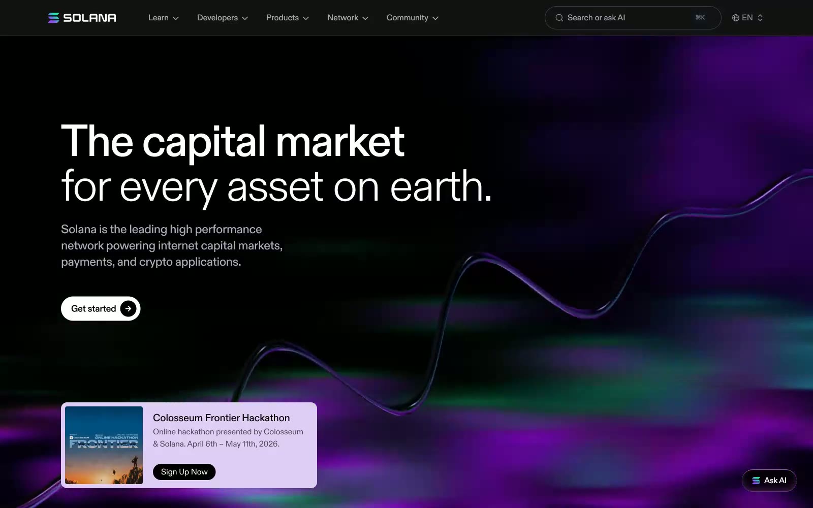
Solana
Solana — Style Reference
# Solana — Style Reference
> neon aurora in a midnight void — flowing magenta and violet ribbons suspended against pure black
**Theme:** dark
Solana operates in a midnight void: a near-black canvas punctuated by flowing neon aurora graphics in violet, magenta, and green. The system is deliberately monochromatic — white and warm-gray typography carry all communication weight, while the only chromatic presence comes from the brand's signature flowing wave illustrations, never from interface chrome. Components are whisper-thin: 1px hairline borders, pill-shaped controls at 9999px radius, and cards that float on barely-distinguishable dark surfaces. The custom Diatype typeface, with its tightly negative letter-spacing that tightens further at display sizes, gives every headline a compressed, futuristic confidence. Buttons achieve a subtle 3D embossed effect through a layered shadow stack that pairs a soft drop shadow with inset white highlights — the chrome looks pressed into the surface rather than floating above it. Density is comfortable, never packed; the page breathes with generous section gaps and lets the aurora graphics do the visual heavy lifting.
## Tokens — Colors
| Name | Value | Token | Role |
|------|-------|-------|------|
| Void Black | `#000000` | `--color-void-black` | Page canvas, deepest background layer — the void against which everything else floats |
| Obsidian | `#0d0c11` | `--color-obsidian` | Card surfaces, elevated panels — a barely-perceptible warm purple-black lift from the canvas |
| Charcoal Press | `#121212` | `--color-charcoal-press` | Dark supporting neutral for text, icons, and strong contrast. Do not promote it to the primary CTA color |
| Onyx | `#12151d` | `--color-onyx` | Navigation bar background, sticky header surface |