AI Prompt Studio - Intelligent Prompt Library
Explore and use professional AI prompts to optimize your workflow.
One-click Use
Websites
Markdown Text
design-md
website-prompt
landing-page-prompt
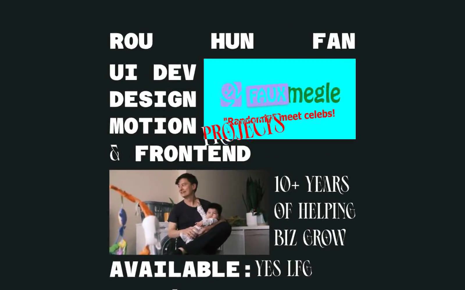
Freelance frontend UI developer and designer, Rou Hun Fan
Freelance frontend UI developer and designer, Rou Hun Fan — Style Reference

# Freelance frontend UI developer and designer, Rou Hun Fan — Style Reference
> Riso-printed zine on black construction paper
**Theme:** dark
A brutalist editorial portfolio for an independent frontend developer: near-black canvas, oversized condensed display type, and a single high-saturation accent block that detonates against the void. Layout behaves like a printed magazine spread — text breaks across asymmetric columns, type meets image at hard edges, and whitespace is used as a structural element rather than padding. The signature move is the cyan card with magenta display text that feels pasted onto the page like a sticker, breaking the monochrome discipline. Typography carries all the weight: a monospaced geometric for system voice, a heavy condensed sans for shouting, and a calligraphic script for editorial flourishes that humanize the machine aesthetic.
## Tokens — Colors
| Name | Value | Token | Role |
|------|-------|-------|------|
| Carbon | `#0a0a0a` | `--color-carbon` | Page canvas and section backgrounds — near-true-black maximizes the contrast pop of white type and saturated accent blocks |
| Bone | `#ffffff` | `--color-bone` | Primary text, display headlines, borders, and link strokes — the only voice for the majority of the page |
| Voltage Cyan | `#1ef0e4` | `--color-voltage-cyan` | Accent card backgrounds, highlight panels — flat saturated cyan that screams against the dark canvas, reserved for project cards and editorial callout blocks |
| Plasma Magenta | `#e91e8c` | `--color-plasma-magenta` | Display text on cyan cards, decorative script flourishes — hot pink/magenta used only as ink-on-cyan contrast or as editorial accent |
Websites
Markdown Text
design-md
website-prompt
landing-page-prompt
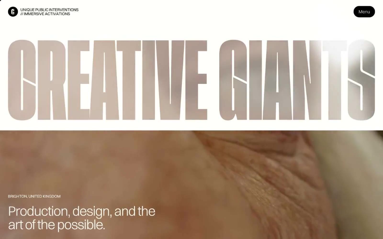
Creative Giants
Creative Giants — Style Reference
# Creative Giants — Style Reference
> oversized editorial poster on cream paper
**Theme:** light
Creative Giants reads like an oversized art-book spread rendered in code: a warm off-white canvas, hairline margins, and display type so large it functions as a poster rather than a heading. The whole system runs on negative space and one weight of light (300) — headlines whisper at 64–84px instead of bolding into shouting, and letter-spacing tightens aggressively (-0.04em) as type grows so the words feel chiseled, not spaced. Chromatic color is rationed into small, saturated hits: vivid magenta, deep teal, powder blue, hot pink, mint, and navy appear as card surfaces or accents, never as background floods. Interactive elements are black-on-cream pills with fully rounded (1440px) radii, and the chrome is almost invisible — a single circular logo mark and a 'Menu' button floating in white space. The visual identity is a production studio's contact sheet: one enormous headline, one full-bleed photograph, one quiet line of meta text. Every other page should follow the same economy.
## Tokens — Colors
| Name | Value | Token | Role |
|------|-------|-------|------|
| Bone White | `#fffef7` | `--color-bone-white` | Page canvas, card surfaces, text on dark accents — a warm off-white that replaces pure #ffffff and gives the whole system a paper-like, printed feel |
| Ink Black | `#000000` | `--color-ink-black` | Dark supporting neutral for text, icons, and strong contrast. Do not promote it to the primary CTA color |
| Graphite | `#666666` | `--color-graphite` | Secondary body text, captions, metadata, helper copy — recedes so display type can dominate |
| Ash | `#aaaaaa` | `--color-ash` | Input borders, inactive link color, tertiary dividers — soft structural gray that disappears when not needed |
Websites
Markdown Text
design-md
website-prompt
landing-page-prompt
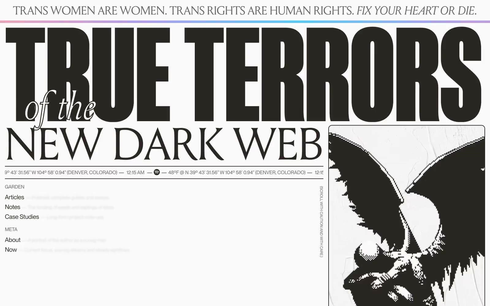
Henry
Henry — Style Reference
# Henry — Style Reference
> Gothic broadside poster on warm cream paper. One hundred percent monochrome, no chromatic accent, all visual intensity carried by display type and full-bleed paper-to-ink inversions.
**Theme:** mixed
Henry Codes reads like an editorial broadside printed in warm ink: near-black headlines carved into cream paper, alternating with full-bleed dark sections where cream serif type glows. The palette is one-hundred-percent warm monochrome — no chromatic accent, no product color, no blue link — every visual move comes from scale, weight, and inversion. Type is the brand: a display serif (Louize) sets poetry and editorial prose, a condensed display sans (Manuka) stamps section headers at 200–370px, and a neo-grotesque (Neue Montreal) carries all UI at 12–24px. The spacing system is austere: 4–32px increments, one radius (12px), no shadows. Sections flip between paper and ink like a broadsheet newspaper, and most screens should be dominated by two or three enormous words rather than illustrated product art.
## Tokens — Colors
| Name | Value | Token | Role |
|------|-------|-------|------|
| Paper | `#fafafa` | `--color-paper` | Page background, card surfaces, inverted-section type — the cream-white ground that all dark type sits on |
| Hairline | `#eeeeee` | `--color-hairline` | Card and tile borders — only visible against Paper |
| Midstone | `#9f9f9f` | `--color-midstone` | Nav borders, muted borders, light decorative borders on dark sections |
| Ash | `#666666` | `--color-ash` | Secondary borders, muted UI text, low-emphasis dividers |
Websites
Markdown Text
design-md
website-prompt
landing-page-prompt
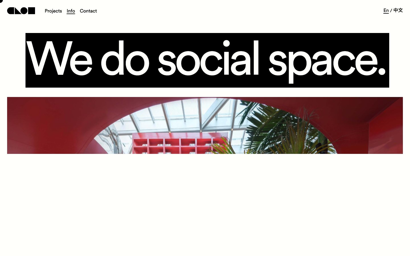
CLOU architects
CLOU architects — Style Reference
# CLOU architects — Style Reference
> ink on cream paper
**Theme:** light
CLOU architects operates in a radical two-color universe: warm cream (#fffffc) and absolute black (#000000). Nothing else is allowed in the interface — every other hue comes from architectural photography bleeding into the layout. The system is built on one geometric sans-serif (Circular Std) pushed to extremes: headlines reach 200px+, letter-spacing tightens aggressively at scale, and line-heights compress to 0.80 for display copy. The cream background is deliberately off-white (not #ffffff), which prevents harshness against the dominant black typography and gives the page a paper-like, gallery-wall warmth. Navigation is a dense black bar; the body is expansive cream; the only "decoration" is the photography itself — full-bleed, unframed, the actual project. This is a design system that says almost nothing visually so the architecture can say everything.
## Tokens — Colors
| Name | Value | Token | Role |
|------|-------|-------|------|
| Cream Paper | `#fffffc` | `--color-cream-paper` | Page canvas, card surfaces, button fills — the slightly warm off-white prevents stark contrast against black ink, giving the entire site a printed-paper warmth rather than a digital-screen feel |
| Ink Black | `#000000` | `--color-ink-black` | All text, borders, navigation background, button borders, icon strokes — the only foreground color in the system, used at full saturation with no opacity reductions |
## Tokens — Typography
Websites
Markdown Text
design-md
website-prompt
landing-page-prompt
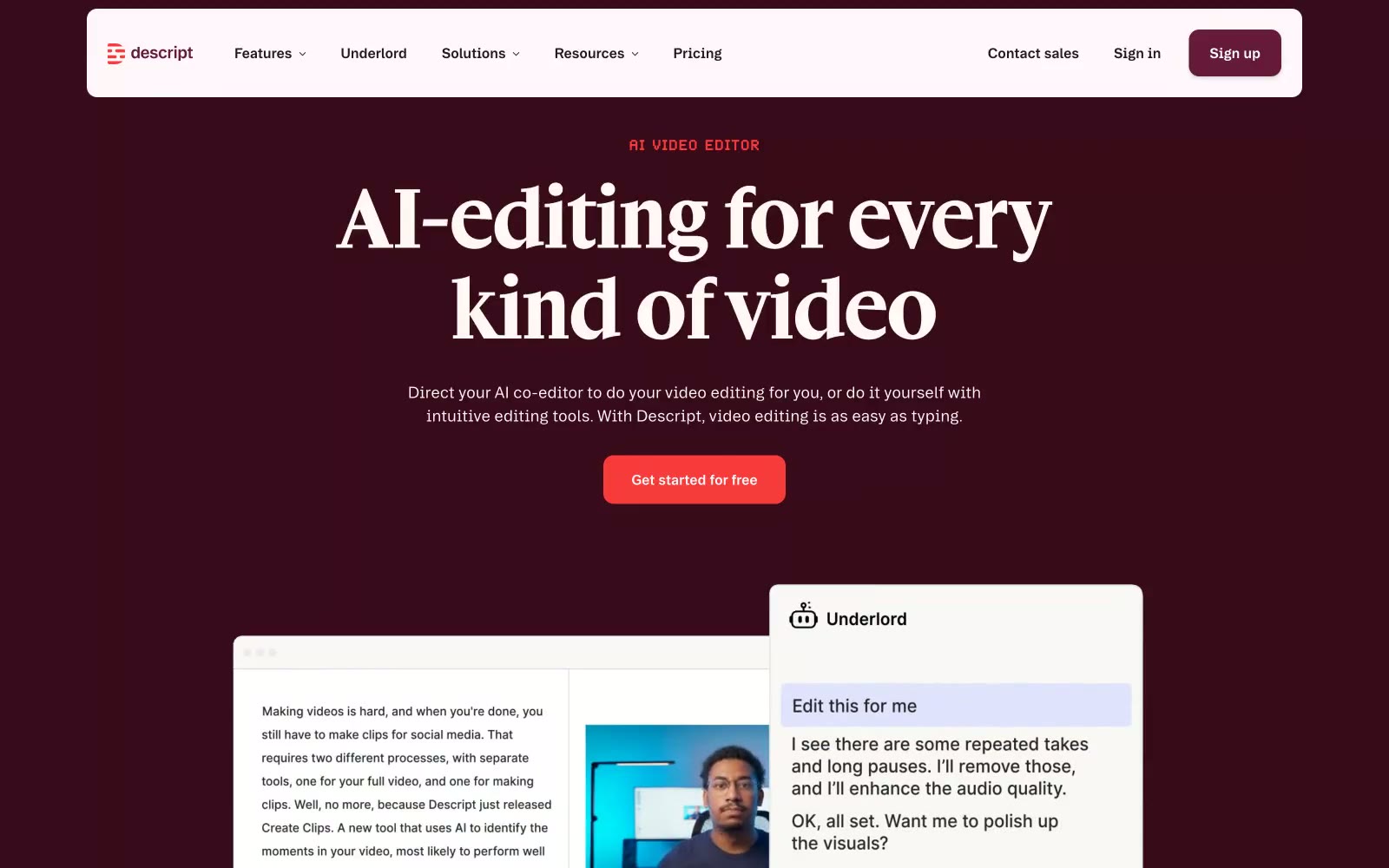
Descript
Descript — Style Reference
# Descript — Style Reference
> Broadcast booth meets editorial press — deep burgundy theater dark, editorial serif headlines, coral on-air signals.
**Theme:** mixed
Descript's visual language is deep burgundy darkness cut by coral-red action — like the interior of a recording booth where the walls absorb everything and only the signal glows. The #390a1a near-black burgundy dominates 70% of the hero, creating a theater-dark immersion that makes the coral-red CTA (#f73b3b) feel like an on-air indicator light. Headlines use Gamuth Display, a custom editorial serif at 88px — an unusual choice for a SaaS product that signals craft and content creation rather than enterprise utility. The light sections (#faf8f7, a warm off-white) provide contrast between dark bands without ever going pure white, keeping the palette unified in warmth. Tag labels like 'AI VIDEO EDITOR' use Brett, a custom typeface with wide 0.04em tracking that mimics broadcast chyron styling.
## Tokens — Colors
| Name | Value | Token | Role |
|------|-------|-------|------|
| Broadcast Burgundy | `#390a1a` | `--color-broadcast-burgundy` | Hero backgrounds, primary dark surface — creates the theater-dark immersion that makes coral CTAs read as on-air signals |
| On-Air Coral | `#f73b3b` | `--color-on-air-coral` | Primary CTA buttons, active section labels — the single vivid signal against deep burgundy dark |
| Hot Take Red | `#ff5340` | `--color-hot-take-red` | Inline text highlights, secondary accent emphasis in body copy |
| Plum Mid | `#651a39` | `--color-plum-mid` | Nav hover states, secondary button backgrounds — one step lighter than Broadcast Burgundy for interactive depth |
Websites
Markdown Text
design-md
website-prompt
landing-page-prompt
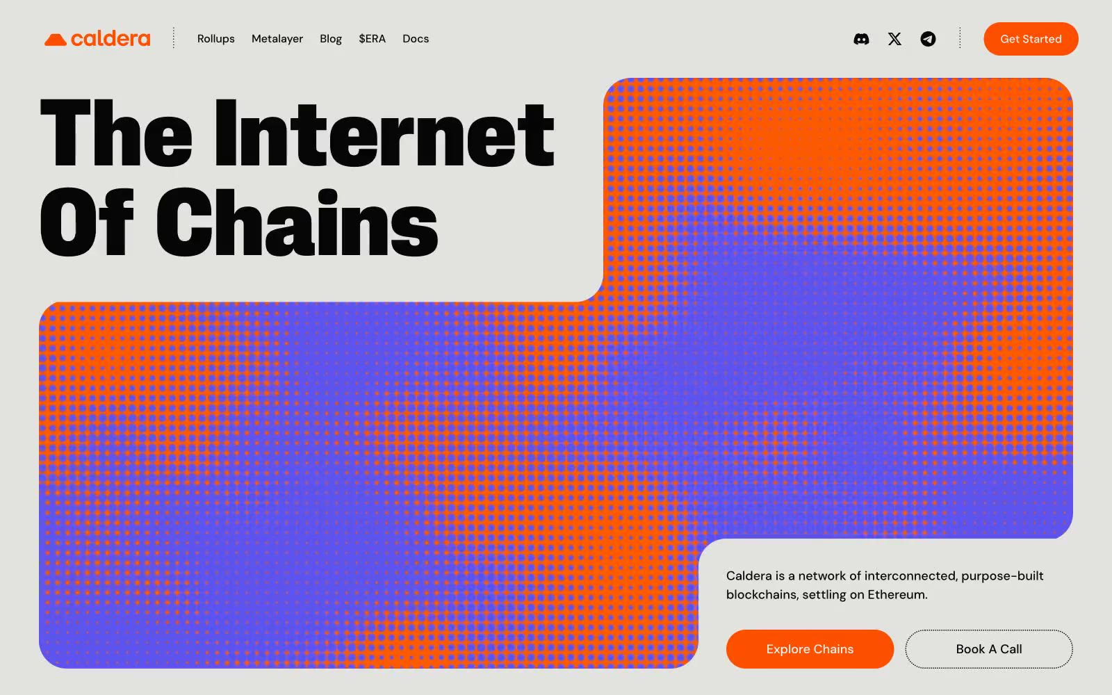
Caldera
Caldera — Style Reference
# Caldera — Style Reference
> Risograph zine on warm concrete
**Theme:** light
Caldera is a brutalist editorial crypto brand: a warm off-white concrete canvas, near-black condensed display type that stretches up to 189px, and a single incandescent orange that does all the interactive work. The visual language borrows from 90s zine culture and risograph printing — halftone dot patterns bridge orange into violet across hero panels and card thumbnails, giving a flat printed feel rather than a glossy product UI. Surfaces stay low and matte: cream cards float on a warm stone canvas, borders are hairline black rather than shadows, and corners are aggressively rounded (40px is the house radius, not 8px). Color is rationed — most of the interface is monochrome black-on-cream, and orange appears only where a user must act, a stat must shout, or a card must signal brand membership.
## Tokens — Colors
| Name | Value | Token | Role |
|------|-------|-------|------|
| Concrete Canvas | `#e2e2df` | `--color-concrete-canvas` | Page background — warm light-gray stone, the dominant surface the whole site sits on |
| Cream Card | `#f7f6f2` | `--color-cream-card` | Card surfaces, stat panels, elevated content blocks — sits one step brighter than the canvas |
| Ink | `#070607` | `--color-ink` | Headlines, body text, hairline borders, and the structural outlines that give the layout its editorial frame |
| Pure Black | `#000000` | `--color-pure-black` | Icon strokes, dense border work, and the deepest text where Ink isn't dark enough |
Websites
Markdown Text
design-md
website-prompt
landing-page-prompt
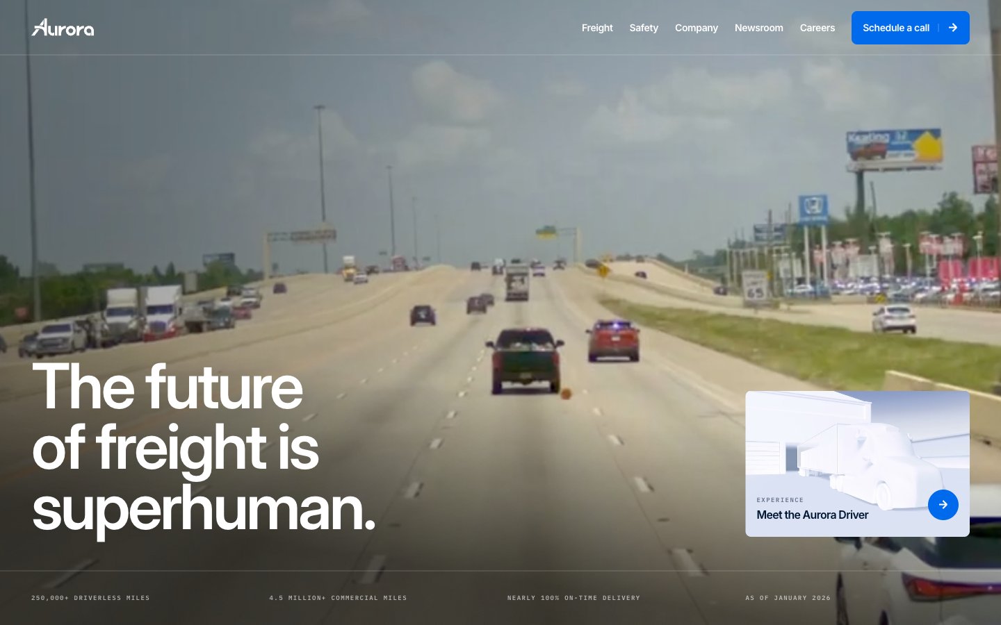
Aurora
Aurora — Style Reference
# Aurora — Style Reference
> autonomous horizon at dawn — a clean white cockpit looking out onto a sunlit highway, one electric blue dial on the dashboard.
**Theme:** light
Aurora's interface is an open highway: a white canvas stretching wide, deep navy type that reads like road markings, and a single electric blue accent that signals action like a turn signal. The hero is a full-bleed dashcam perspective with a 90px white headline overlaid — the photography carries the emotional weight, the UI stays out of the way. Below the fold, surfaces shift to cool pale-gray cards, paragraphs reveal themselves word-by-word as the user scrolls, and the signature cyan-to-cobalt gradient is reserved for the moments that should feel like the brand's namesake — rare, vivid, always purposeful. Everything is rectilinear with 8px corners, no shadows, no decorative flourishes; depth comes from layering color and scale, never from elevation.
## Tokens — Colors
| Name | Value | Token | Role |
|------|-------|-------|------|
| Horizon Navy | `#001733` | `--color-horizon-navy` | Primary text, nav text, heading fills, dark image borders, section backgrounds — the dominant ink of the system, never pure black |
| Signal Blue | `linear-gradient(269.64deg, #18dcdc -20.36%, #006aed 109.5%)` | `--color-signal-blue` | Primary action backgrounds, filled CTA buttons, active nav state, circular icon buttons, link accents on dark surfaces — vivid cobalt that earns the click; Signature gradient for brand-defining moments — the only place cyan appears, anchoring the visual identity |
| Cyan Dawn | `#18dcdc` | `--color-cyan-dawn` | Gradient stop for the Aurora signature gradient — never used as a solid fill, only as the opening note of the spectrum |
| Slate Whisper | `#68748d` | `--color-slate-whisper` | Secondary body text, muted helper copy, inactive meta — cool gray that recedes behind Horizon Navy |
Websites
Markdown Text
design-md
website-prompt
landing-page-prompt
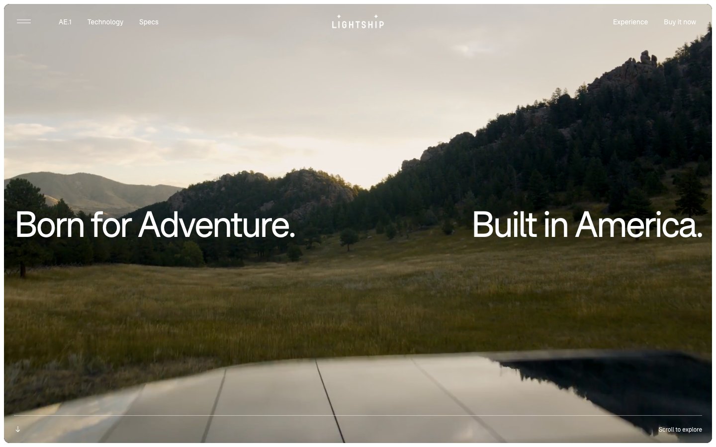
Lightship
Lightship — Style Reference
# Lightship — Style Reference
> Cinematic open-road diorama. Warm cream gallery walls with oversized landscape photographs pinned at gentle radii, thin black type whispering across the frames, one ember-orange accent breaking the monochrome like a campfire in a meadow.
**Theme:** light
Lightship is a photography-first editorial system built on a warm cream canvas (#faf6ef) with full-bleed cinematic imagery doing all the storytelling. The UI is deliberately invisible: a single custom geometric sans (F37Bolton) with tight negative tracking, hairline borders, 20px rounded photo cards, and pill-shaped navigation chips. The entire palette is near-monochrome with one warm orange (#fa5c40) reserved as a rare surface accent. Density is generous — large breathing room around elements, 100px section gaps — letting landscape photography and short editorial headlines command attention. No shadows, no gradients, no decorative chrome: the product and the places it goes are the interface.
## Tokens — Colors
| Name | Value | Token | Role |
|------|-------|-------|------|
| Warm Cream | `#faf6ef` | `--color-warm-cream` | Primary page canvas, card surfaces — warm off-white replaces stark white to soften the photography-first layout and avoid the cold SaaS feel |
| Pure White | `#ffffff` | `--color-pure-white` | Image borders, elevated card surfaces, contrast panel behind embedded media |
| Obsidian | `#000000` | `--color-obsidian` | Primary text, hairline borders, icon strokes, navigation typography — the structural anchor of the entire system |
| Pebble | `#999999` | `--color-pebble` | Muted body text, secondary borders, disabled states — the one step above placeholder gray |
Websites
Markdown Text
design-md
website-prompt
landing-page-prompt
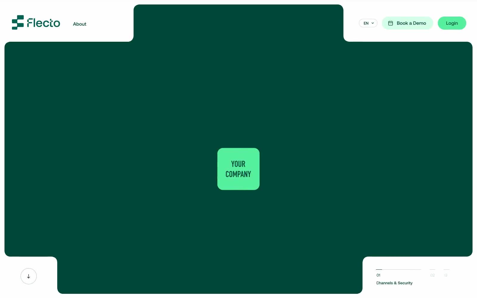
Flecto
Flecto — Style Reference
# Flecto — Style Reference
> Botanical greenhouse glasshouse. A warm cream-walled conservatory where deep teal planters hold bright mint seedlings — flat, rounded, alive with green, zero shadows.
**Theme:** mixed
Flecto is a warm botanical rental platform aesthetic: a cream canvas (#fffbec) replaces pure white, deep forest teal (#004737) anchors hero sections and borders, and vivid mint (#56f09f) punctuates interactive moments. Typography is exclusively Aeonik at weight 400 — no bold, no light — relying on negative letter-spacing (-0.043em at display sizes) to create contrast through tightness rather than weight. The system is flat, border-driven, and color-blocked: large rounded surfaces (40–60px radius) in deep teal sit directly on the warm cream, with thin chromatic borders carrying most of the structural weight instead of shadows. Mint appears sparingly as a functional accent on filled buttons, icons, and decorative shapes, never as large surface area.
## Tokens — Colors
| Name | Value | Token | Role |
|------|-------|-------|------|
| Forest Ink | `#004737` | `--color-forest-ink` | Dominant brand surface — hero panels, section backgrounds, thick structural borders, nav header, footer blocks. Deep teal absorbs the page and makes cream text glow |
| Mint Pulse | `#56f09f` | `--color-mint-pulse` | Green outline accent for tags, dividers, and focused UI edges. Do not promote it to the primary CTA color |
| Mint Mist | `#d4ffe8` | `--color-mint-mist` | Green accent for outlined action borders, linked labels, and lightweight interactive emphasis. Do not promote it to the primary CTA color |
| Cream Canvas | `#fffbec` | `--color-cream-canvas` | Page background — warm off-white replaces pure white. Border-color on teal sections, card fills on light areas, heading text on dark surfaces |
Websites
Markdown Text
design-md
website-prompt
landing-page-prompt
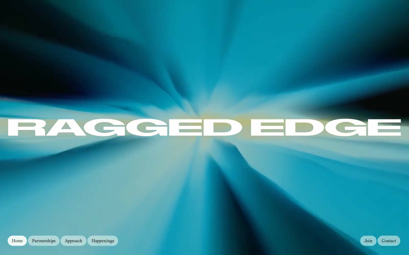
Ragged Edge
Ragged Edge — Style Reference
# Ragged Edge — Style Reference
> Editorial brutalism on white marble. Imagine Vogue's typographic confidence merged with a Berlin gallery's color restraint — all ink and air, with one burst of color used as exclamation, never decoration.
**Theme:** light
Ragged Edge operates as a confident brand consultancy site built on near-total monochrome discipline: near-black ink on white, with a single saturated violet used sparingly as an outlined accent and a singular full-bleed gradient hero that acts as the only chromatic event on the homepage. Typography is the entire personality — an extremely expanded uppercase display face (ABCDiatypeExpanded) does the shouting while a refined serif (Grit) does the talking, creating a tension between editorial magazine typography and brutalist display letterforms. Layouts are maximalist in scale (full-bleed hero, 180px section gaps) but minimal in palette, and all interactive surfaces are pill-shaped with radii in the 40–64px range, giving every button and nav item a soft capsule form that contrasts against the angular expanded type.
## Tokens — Colors
| Name | Value | Token | Role |
|------|-------|-------|------|
| Obsidian Ink | `#181f1f` | `--color-obsidian-ink` | Primary text, hairline borders, filled action buttons — the dominant near-black that carries 90% of the interface |
| Paper White | `#ffffff` | `--color-paper-white` | Canvas background, inverted text on dark blocks, nav/button borders |
| Fog | `#d1d2d2` | `--color-fog` | Subtle dividers and secondary borders where Obsidian would be too heavy |
| Ash | `#a3a5a5` | `--color-ash` | Muted helper text, inactive button borders, secondary metadata |
Websites
Markdown Text
design-md
website-prompt
landing-page-prompt
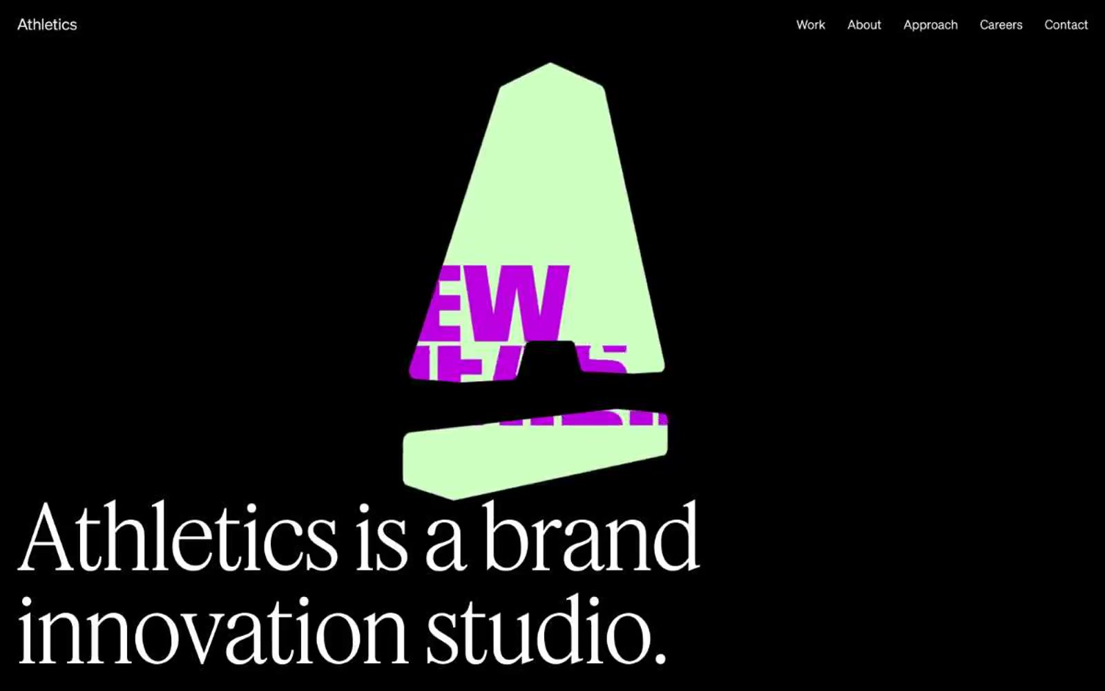
Athletics
Athletics — Style Reference
# Athletics — Style Reference
> monograph on black velvet
**Theme:** dark
Athletics operates as a gallery-grade creative studio: the entire experience sits on a dark canvas, letting enormous light-weight serif display type breathe against deep charcoal and pure black. The system is ruthlessly monochromatic — zero chromatic color across the interface, with warmth and saturation living exclusively inside editorial photography and the brand mark. Typography does the heavy lifting: a high-contrast pairing of a delicate serif display (Feature Deck at 300 weight, 72–116px) against a quiet grotesque (Söhne at 300/400 for everything functional). The layout is full-bleed, generous, and editorial — wide section gaps of 128–144px, asymmetric two-column blocks, and a vertical service index annotated with A/B/C/D letter labels that evoke a printed specimen sheet. Components are minimal: pill-shaped tags, hairline borders, no shadows, no gradients, no elevation. It reads as confident, restrained, and considered — the design equivalent of a well-typeset monograph.
## Tokens — Colors
| Name | Value | Token | Role |
|------|-------|-------|------|
| Obsidian | `#000000` | `--color-obsidian` | Page canvas, deepest section backgrounds, hairline borders on text |
| Charcoal | `#1d1d1d` | `--color-charcoal` | Elevated section surfaces, card backgrounds, input fields — the middle layer between pure black and white |
| Paper White | `#ffffff` | `--color-paper-white` | Primary display and body text on dark surfaces, default borders, icon strokes, form controls |
| Ash | `#d6d5d0` | `--color-ash` | Hairline borders, dividers, input outlines, and card edges on light surfaces. |
Websites
Markdown Text
design-md
website-prompt
landing-page-prompt
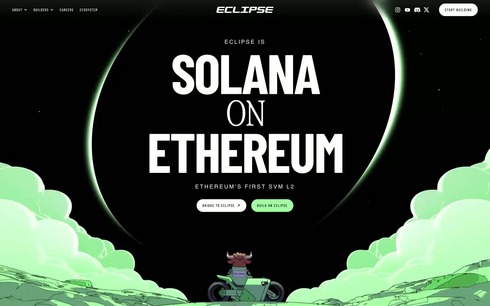
Eclipse
Eclipse — Style Reference
# Eclipse — Style Reference
> Cel-shaded neon comic strip — think Akira signage rendered as a finance terminal.
**Theme:** mixed
Eclipse runs a monochromatic canvas with a single neon-green pulse — the visual grammar is closer to a 90s anime cel than a blockchain dashboard. Headlines use GT Alpina Condensed at hairline weights (100–200), the thinnest possible serif line that still reads as letterforms, paired with Barlow Condensed for compact UI chrome. The single chromatic token (#a1fea0) behaves like a highlighter drawn over an ink-on-paper sketch: borders, button fills, cloud illustrations, and glow halos all share that one vivid green against pure black and white. Surfaces are flat — no shadows, no gradients, no elevation tricks. Buttons are fat pills (25px radius), labels are tracked-out typewriter caps, and illustration carries the atmosphere while the type does the structural work.
## Tokens — Colors
| Name | Value | Token | Role |
|------|-------|-------|------|
| Eclipse Green | `#a1fea0` | `--color-eclipse-green` | Primary action fill, active nav state, decorative border accents, cloud and glow illustration fills, investor-card spotlight — the only chromatic token in the system, applied sparingly to make each occurrence feel like a marker pen stroke |
| Ink Black | `#000000` | `--color-ink-black` | Body and heading text, hairline borders across cards/badges/buttons, footer rules, outlined button stroke — the dominant neutral that carries all structural lines |
| Paper White | `#ffffff` | `--color-paper-white` | Page canvas, card surfaces, button text on dark fills, nav backgrounds, image backdrop — the base layer everything sits on |
Websites
Markdown Text
design-md
website-prompt
landing-page-prompt
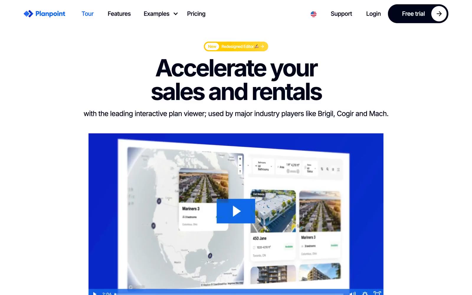
Planpoint
Planpoint — Style Reference
# Planpoint — Style Reference
> Blueprint on white drafting table — an interactive property plan rendered on pristine paper, with one blue pen and one yellow highlighter for emphasis.
**Theme:** light
Planpoint uses a clean, white-canvas real estate blueprint aesthetic: generous whitespace, pill-shaped components, and bold confident display type that reads like a property floor plan drafted on quality paper. The interface is nearly monochromatic — near-black text (#1d1d1f) and white surfaces carry the entire structural weight — with a single vivid blue (#0f68ea) reserved exclusively for the primary action and a warm yellow (#ffcb00) that appears only as novelty punctuation. Components stay light and soft: large pill radii, one barely-there drop shadow at 6% opacity, and no decorative gradients or skeuomorphism. Typography is the dominant design element: Inter at extreme sizes (50–72px headlines, 144px display) with tight negative tracking gives the page architectural authority, while body text sits at a comfortable 16–18px with generous line height.
## Tokens — Colors
| Name | Value | Token | Role |
|------|-------|-------|------|
| Ink | `#1d1d1f` | `--color-ink` | Primary text, icon strokes, dark button fills — a slightly warm near-black chosen over pure black to feel printed rather than digital |
| White | `#ffffff` | `--color-white` | Page background, card surfaces, button text on dark fills, all input fields |
| Mist | `#f0f2f4` | `--color-mist` | Subtle surface elevation, inactive button fills, secondary card backgrounds |
| Fog | `#e5e6e8` | `--color-fog` | Hairline borders, subtle dividers, section separators |
Websites
Markdown Text
design-md
website-prompt
landing-page-prompt
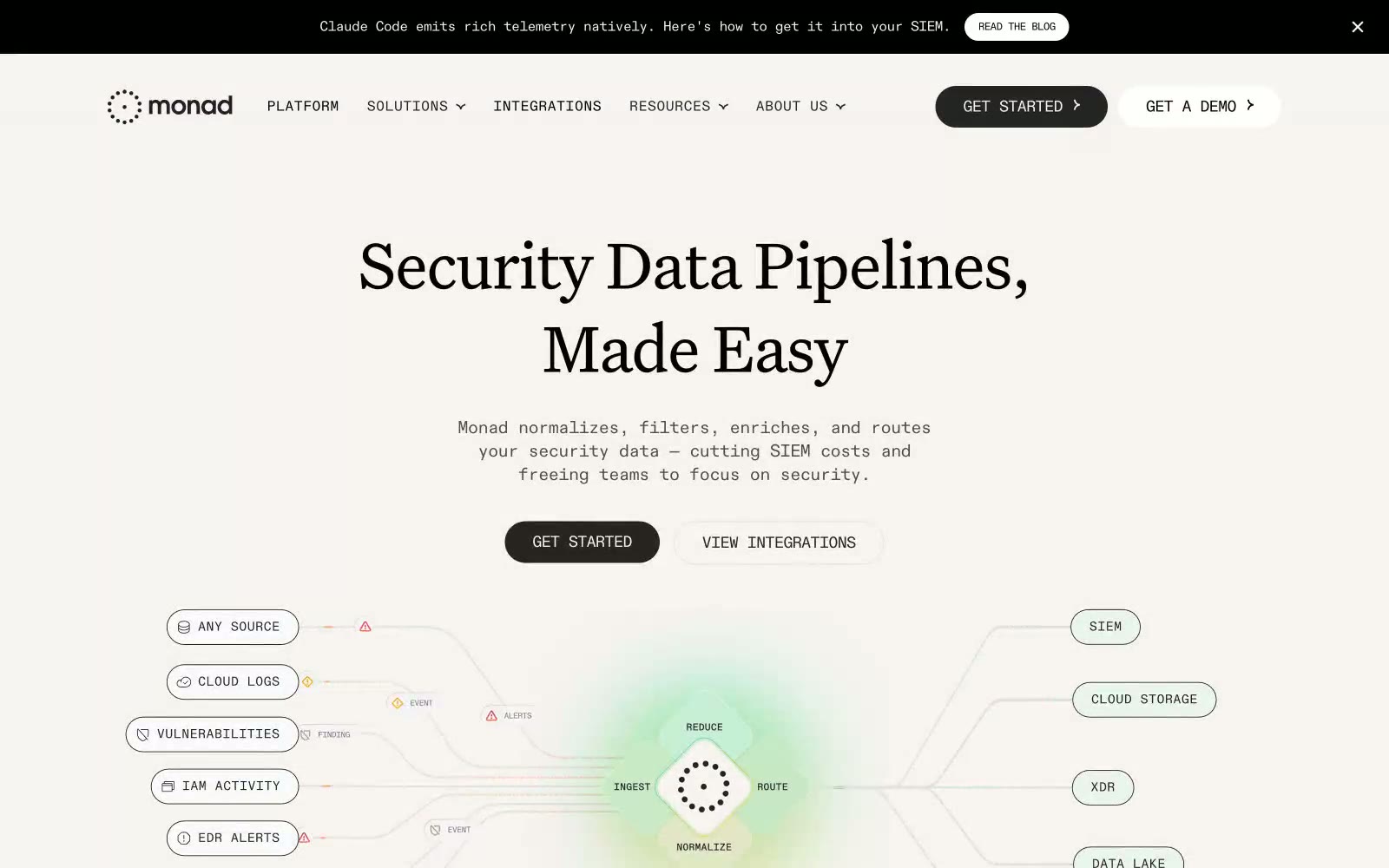
Monad
Monad — Style Reference
# Monad — Style Reference
> Monospaced technical journal on cream paper — quiet, precise, editorial.
**Theme:** light
Monad renders as a quiet editorial document on warm parchment: cream canvas, charcoal ink, and a single near-gray lavender card surface carry the entire UI. The signature move is type — a humanist serif at 400 weight for headlines paired with a monospaced font for nearly all UI text creates a technical-journal feel that is rare in B2B SaaS. Color is almost completely absent from the interface; the peach, lavender, and mint tones that exist are confined to the data-flow diagram in the hero, where they behave as soft atmospheric washes rather than brand accents. Components are flat and confident: 100px pill buttons, 40px-radius cards, hairline borders in near-black, and a single soft ambient shadow — nothing is heavy, nothing is glossy. The overall rhythm is generous breathing room, centered text stacks, and horizontal flow lines that suggest movement without animation.
## Tokens — Colors
| Name | Value | Token | Role |
|------|-------|-------|------|
| Parchment Cream | `#f6f3f1` | `--color-parchment-cream` | Page canvas, nav background, badge surfaces — the warm off-white base that makes the entire interface feel like paper rather than screen |
| Ink Black | `#000000` | `--color-ink-black` | Primary text, icon strokes, hairline borders, and the dominant outline color across nav, cards, and dividers |
| Charcoal | `#242424` | `--color-charcoal` | Primary action button fill, badge borders, elevated surface — filled CTAs sit slightly off pure black for visual softness |
| Graphite | `#4e4d4d` | `--color-graphite` | Body and heading text at lower contrast, secondary card borders, muted UI elements |
Websites
Markdown Text
design-md
website-prompt
landing-page-prompt
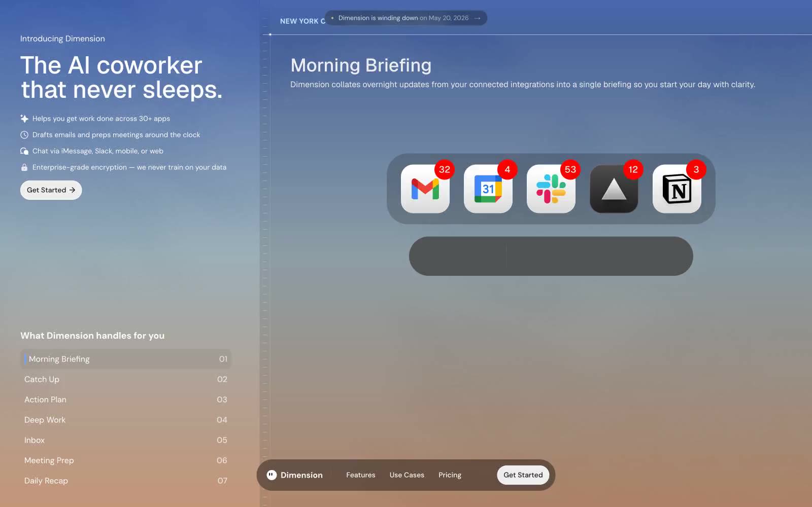
Dimension
Dimension — Style Reference
# Dimension — Style Reference
> Pre-dawn glassmorphic command deck
**Theme:** dark
Dimension speaks in a near-monochrome dark register: a near-black canvas, glassmorphic surfaces that float above it, and one muted indigo that surfaces only as accent punctuation. Typography is restrained and humanist — DM Sans for body, Geist for display — letting the 72px whisper-weight headlines carry the room without color needing to shout. Components are pill-shaped or soft-rounded; nearly every interactive element (buttons, nav, tags, the floating dock) uses a 9999px radius, while cards settle into 24–40px curves. The page breathes: generous vertical rhythm, thin hairline borders in #e5e5e5 at low opacity, and minimal elevation — depth comes from translucency and blur, not shadow stacks.
## Tokens — Colors
| Name | Value | Token | Role |
|------|-------|-------|------|
| Void | `#0a0a0a` | `--color-void` | Page background, deep surface — the canvas everything floats above |
| Char | `#1d1d1d` | `--color-char` | Elevated card surface, modal background |
| Iron | `#3d3d3d` | `--color-iron` | Mid-tier surface, hover state on dark elements |
| Slate | `#505050` | `--color-slate` | Disabled surface, secondary button background |
Websites
Markdown Text
design-md
website-prompt
landing-page-prompt
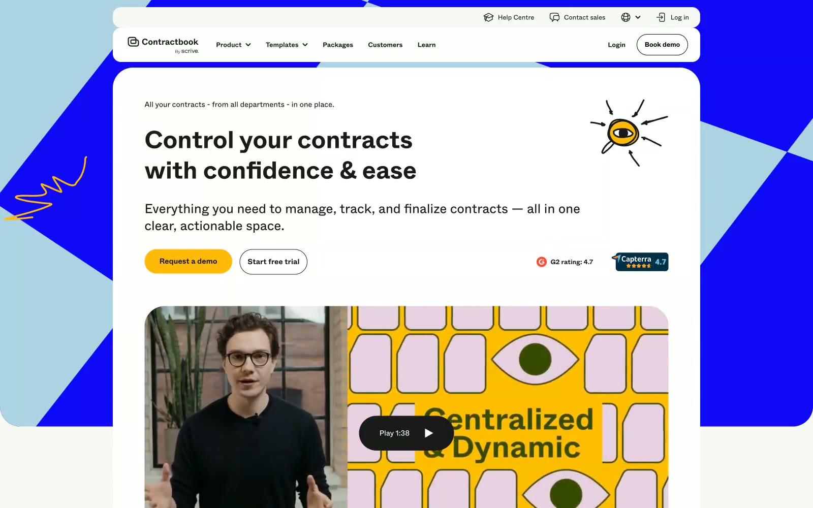
Contractbook
Contractbook — Style Reference
# Contractbook — Style Reference
> "Warm cream atelier with electric violet punctuation and a single yellow spark" — a designer-friendly contract workspace that feels like a Scandinavian studio more than a law firm.
**Theme:** light
Contractbook operates as an editorial SaaS canvas: a warm linen-cream base (#f0f0ec) flooded with off-white surface cards, anchored by a single electric violet (#1009f6) that powers primary action and geometric hero atmosphere. A solar yellow (#ffba09) acts as a warm secondary accent for the most desirable 'Request a demo' entry point, creating a two-button hierarchy where yellow owns intimacy and violet owns enterprise. The system pairs confident 700-weight display type at 40-48px with airy 400-weight body, using a custom geometric sans (Abcwhyte) that gives the interface a designer-publication feel rather than a typical dashboard. Playful hand-drawn illustrations (eye, dartboard, scribbles) in the brand palette inject humanity between functional blocks. Components favor generous 24-40px radii, pill-shaped controls (999px), and minimal elevation — the cream surface itself does the work that shadows do elsewhere.
## Tokens — Colors
| Name | Value | Token | Role |
|------|-------|-------|------|
| Electric Violet | `#1009f6` | `--color-electric-violet` | Primary brand color — hero backgrounds, geometric panels, primary action buttons, active nav — vivid blue-violet that reads as both trustworthy and unconventional against the warm cream canvas |
| Solar Yellow | `#ffba09` | `--color-solar-yellow` | Yellow action color for filled buttons, selected navigation states, and focused conversion moments. |
| Ink Black | `#1a1a1a` | `--color-ink-black` | Primary text, icon strokes, dark buttons, default borders — near-black with a whisper of warmth to harmonize with the cream surface |
| Pure White | `#ffffff` | `--color-pure-white` | Card surfaces, input fills, button text on dark fills — the elevated layer floating above the cream base |
Websites
Markdown Text
design-md
website-prompt
landing-page-prompt
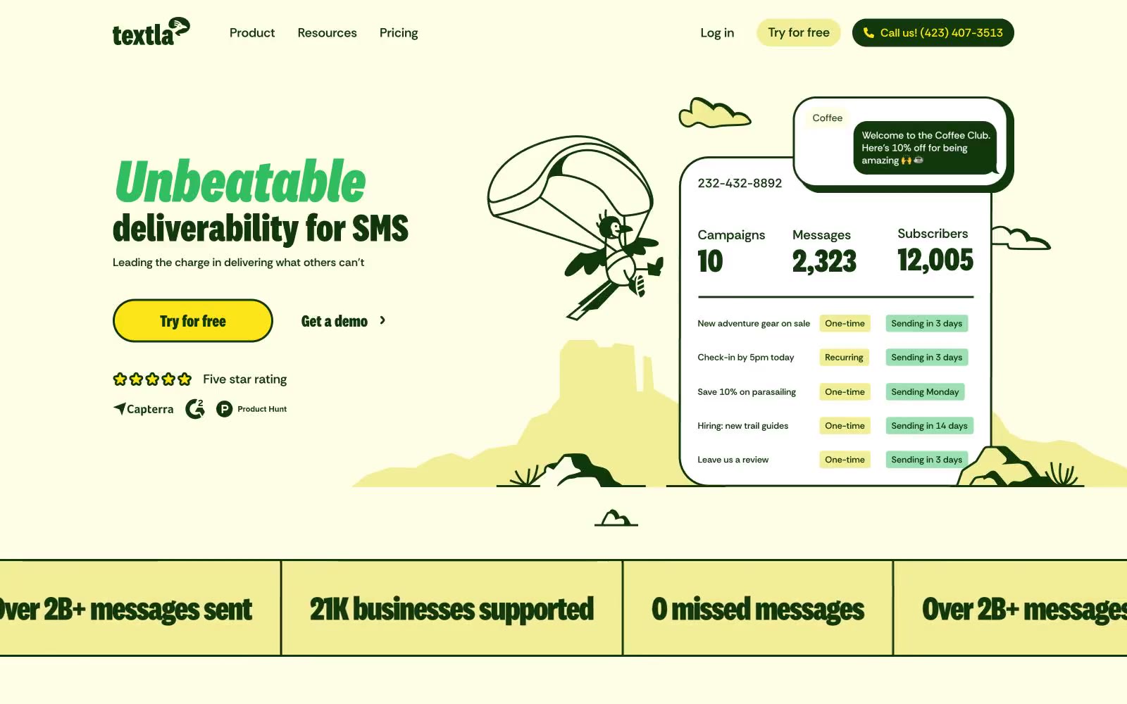
Textla
Textla — Style Reference
# Textla — Style Reference
> Sunlit retro botanical almanac — a cream-yellow page printed in deep forest green, illustrated with cactus line art, stamped with hard offset shadows.
**Theme:** light
Textla wraps an SMS marketing product in a sunlit retro botanical almanac: a warm cream-yellow canvas (#f2ee98) carries every page, with deep forest green (#10380b) doing the work of ink, border, shadow, and brand mark. Typography is the loudest voice — a condensed display face (National 2 Condensed) drives oversized italicized headlines up to 180px while a heavy sans (RethinkSans, 600-800) handles all UI at 16-20px, giving the system a printed-poster confidence. Components lean neobrutalist: hard 8px offset shadows in the brand green, 1440px pill controls, 40px-rounded cards, and star ratings in vivid marigold yellow. Hand-drawn line illustrations of cacti, clouds, and desert figures fill the negative space, making the product feel like a vintage field guide rather than a dashboard.
## Tokens — Colors
| Name | Value | Token | Role |
|------|-------|-------|------|
| Sunlit Cream | `#f2ee98` | `--color-sunlit-cream` | Page canvas and section background — the warm desert-light base that sets the system's botanical mood |
| Forest Ink | `#10380b` | `--color-forest-ink` | Primary text, pill button fills, icon strokes, hard offset shadow, and brand mark — the single deep green that does 80% of structural work |
| Marigold | `#fce519` | `--color-marigold` | Yellow state accent for badges, validation surfaces, and short status labels. Do not promote it to the primary CTA color |
| Sage Wash | `#dbe8ac` | `--color-sage-wash` | Muted card and surface tint — a soft botanical green used for subtle panel differentiation on the cream canvas |
Websites
Markdown Text
design-md
website-prompt
landing-page-prompt
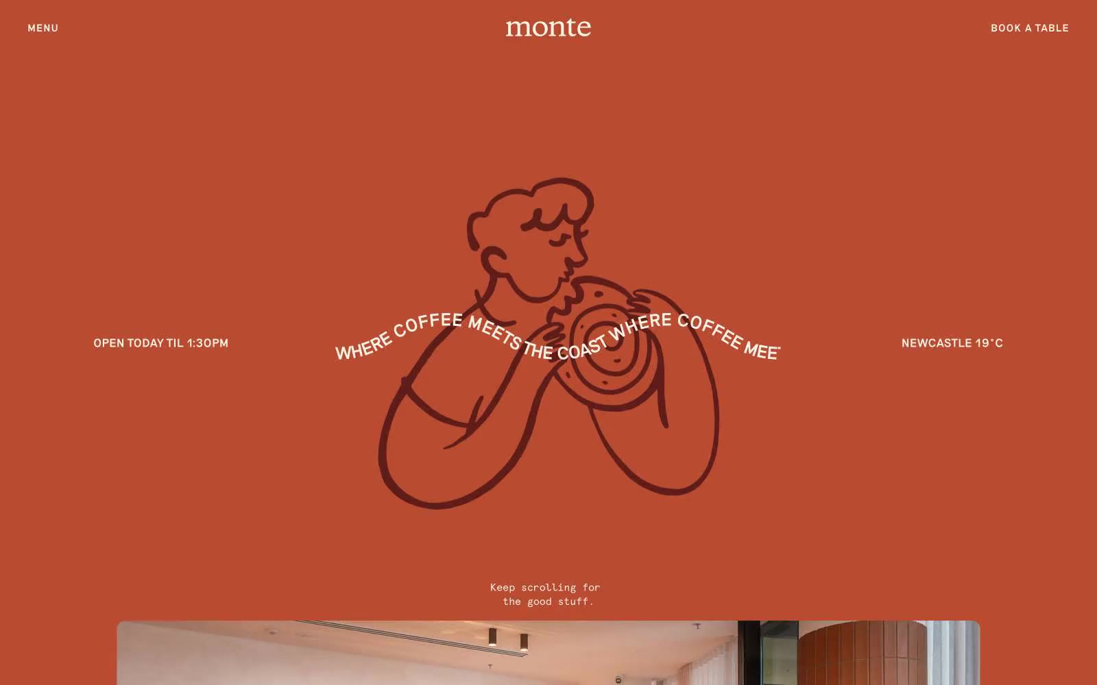
Monte
Monte — Style Reference
# Monte — Style Reference
> rust-tinted coastal morning
**Theme:** light
Monte Café is a sun-baked coastal café language: a single dominant terracotta field floods the hero like rusted corten steel under a Newcastle morning, then dissolves into warm cream interiors and café photography. The design is built on two surfaces only — terracotta and cream — and a single serif face (Riposte) that does all the talking, from eyebrow labels to display headlines. Apercu Mono appears as small functional print for metadata, hours, and temperature. The mood is hand-drawn and human: line-art illustrations, curved headline text wrapping circular forms, pill-shaped ghost buttons, and generous breathing room. There are no shadows, no gradients, no decorative chrome — just ink, warmth, and white space.
## Tokens — Colors
| Name | Value | Token | Role |
|------|-------|-------|------|
| Corten | `#b84b30` | `--color-corten` | Primary brand color — hero field, headline text, icon strokes, pill button borders, link accents. The defining rust-orange that makes every page read as Monte |
| Bordeaux | `#5f1d1a` | `--color-bordeaux` | Deep brand accent for SVG illustration fills and occasional link hover. Used sparingly as a deeper register of Corten |
| Sandstone | `#f8f4e9` | `--color-sandstone` | Primary canvas — body section backgrounds, card surfaces, text on terracotta fields. The warm cream that carries every page after the hero |
| Driftwood | `#e5e7eb` | `--color-driftwood` | Hairline borders, dividers, and card outlines. A barely-there neutral that separates without shouting |
Websites
Markdown Text
design-md
website-prompt
landing-page-prompt
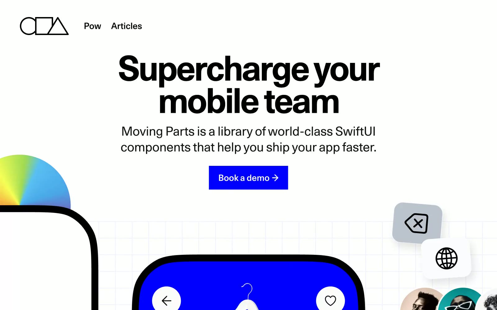
Moving Parts
Moving Parts — Style Reference
# Moving Parts — Style Reference
> Electric blueprint on matte paper — a monochrome architect's sheet that learned to glow blue. Pure black, pure white, one bolt of #0000ff.
**Theme:** mixed
Moving Parts is a high-contrast tool for builders: matte white canvas, pure black ink, and one electric blue (#0000ff) that does all the chromatic work — filled buttons, borders, active states, and the product surfaces themselves. The type system is deliberately polyglot: Unica77 carries the voice everywhere (with eight stylistic alternates engaged), Whyte Semi-Mono handles UI chrome and labels, and display moments pivot to extreme display faces like Druk XXCondensed at 195–248px and Fraunces serifs at 100-weight thin. Hierarchy comes from font selection and weight, not size alone. Cards float with very large radii (76–106px), shadows are rare and heavy (rgba(0,0,0,0.3) 15px 20px 30px), and yellow (#fffc52) appears as a flat accent surface to break sections — never as text or decorative gradient. A single conic-gradient sphere anchors the hero as the only ornamental flourish; everything else stays industrial and quiet.
## Tokens — Colors
| Name | Value | Token | Role |
|------|-------|-------|------|
| Electric Ink | `#0000ff` | `--color-electric-ink` | Primary CTA fill, active nav, product surface backgrounds, chromatic borders — the only saturated color that carries meaning |
| Voltage Green | `#00d37c` | `--color-voltage-green` | Green wash for highlight backgrounds, decorative bands, and soft emphasis behind content |
| Onyx | `#000000` | `--color-onyx` | Body text, headings, hairline borders, icon strokes — the dominant ink color |
| Pure | `#ffffff` | `--color-pure` | Page canvas, card surface, button text, dark-section contrast text |
Websites
Markdown Text
design-md
website-prompt
landing-page-prompt
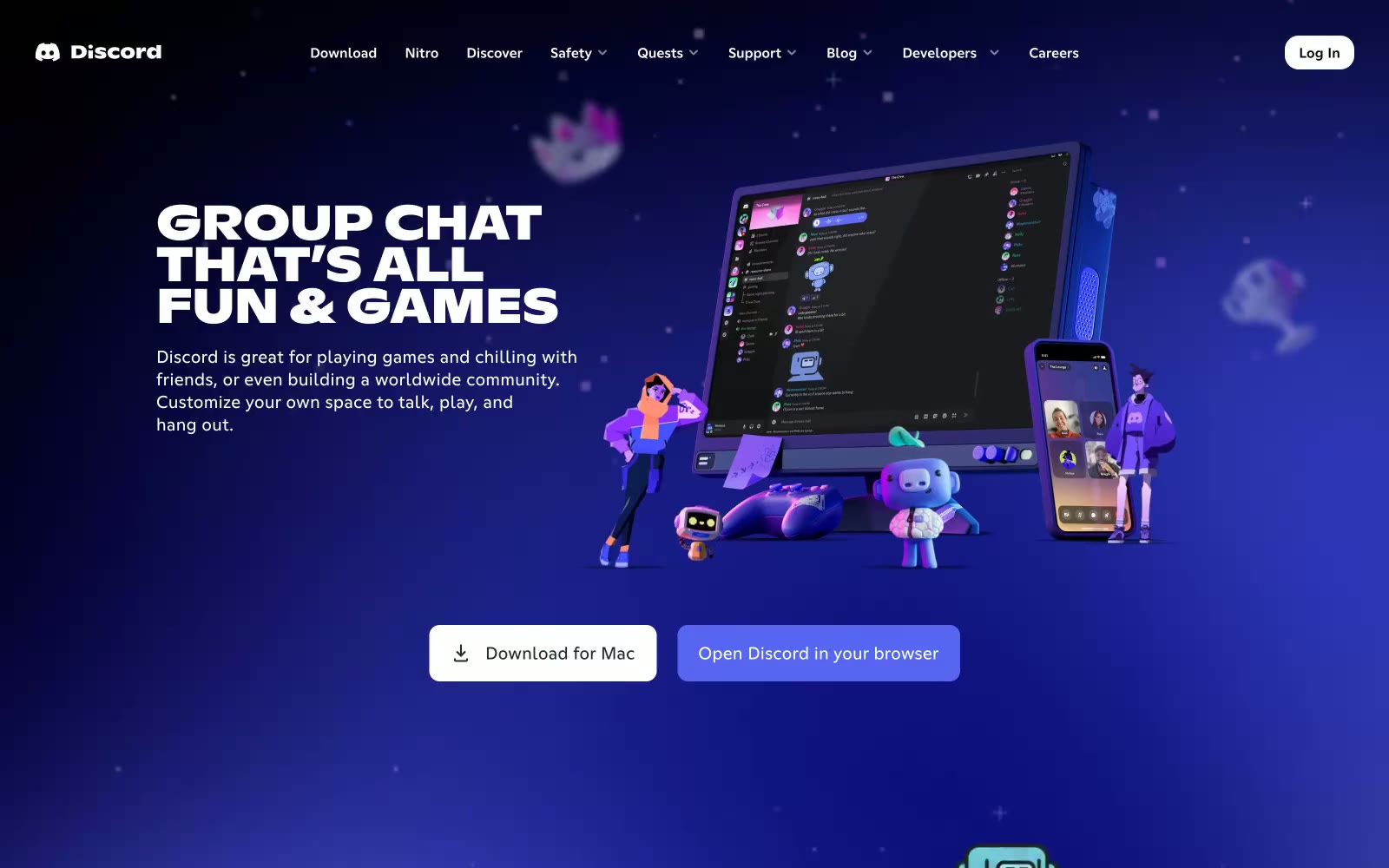
Discord
Discord — Style Reference
# Discord — Style Reference
> Game world behind a chat bubble — every section is a self-contained environment with its own lighting and cast of characters.
**Theme:** dark
Deep cosmic blue fills every section like a starfield at 2am — not a background choice but a total environment. The hero plunges into a rich indigo-to-navy gradient populated with 3D characters, product screens, and floating mascots, making the UI feel like a game world rather than a marketing page. Blurple (#5865F2) — Discord's owned hue — appears only on primary CTAs, creating a controlled pop against the blue-black atmosphere. Typography does the heavy lifting: ABC Ginto Nord at weight 800 with tight -0.01em tracking slams headlines into all-caps blocks that feel like stamped metal, while body copy at 16px/1.5 stays conversational. The overall effect is a gaming-native space where every section is its own immersive stage, not a content column.
## Tokens — Colors
| Name | Value | Token | Role |
|------|-------|-------|------|
| Blurple | `#5865f2` | `--color-blurple` | Primary CTA buttons, brand icon, active states — the single chromatic anchor in a near-monochrome blue-black space, creating instant recognition as the only saturated element in the layout |
| Dark Blurple | `#3442d9` | `--color-dark-blurple` | Hover state for primary buttons, pressed states |
| Hover Blurple | `#8891f2` | `--color-hover-blurple` | Button hover tint, elevated blurple interactions |
| Spring Green | `#57f287` | `--color-spring-green` | Online status indicators, success states |
Websites
Markdown Text
design-md
website-prompt
landing-page-prompt
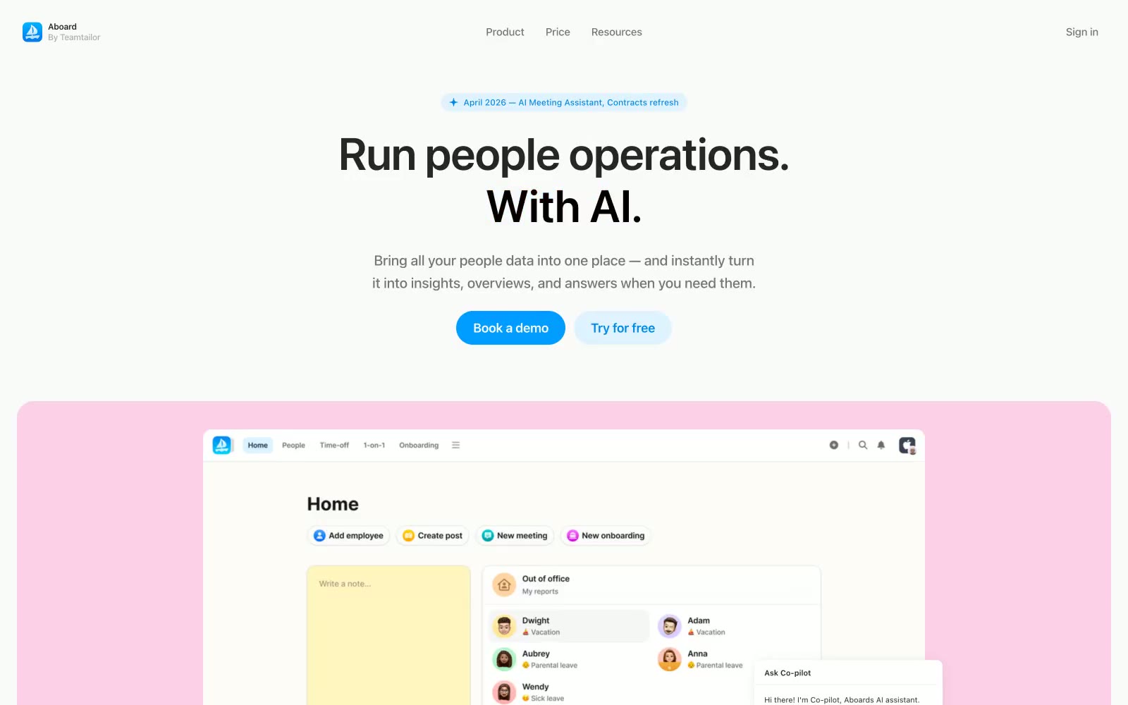
Aboard
Aboard — Style Reference
# Aboard — Style Reference
> pastel paper notebook on a white desk
**Theme:** light
Aboard is a light, airy people-ops workspace that lives on a near-white canvas with a single vivid blue doing the work of a brand color and a palette of five pastel card surfaces doing the work of warmth. Typography leans on system-ui at compressed tracking: very large, very tight headlines (64px at -0.64px) sit above a neutral gray body, so the page reads confident and editorial rather than marketing-loud. Components are soft and rounded — 24px card radius, 99px pill buttons, 10px on small elements — and elevation is replaced by pastel color washes instead of shadows, which keeps the interface feeling like paper stationery rather than glass. Decorative emoji inlined into copy and pastel product-mockup cards give the brand a playful, almost notebook-like personality.
## Tokens — Colors
| Name | Value | Token | Role |
|------|-------|-------|------|
| Canvas | `#fafafa` | `--color-canvas` | Page background, default surface — sets the off-white, paper-like base for the entire system |
| Pure White | `#ffffff` | `--color-pure-white` | Product UI panels, card surfaces, elevated content blocks — keeps content crisp against the off-white canvas |
| Ink | `#262626` | `--color-ink` | Primary headings and body text — softened black that reads warm rather than harsh |
| Graphite | `#757577` | `--color-graphite` | Secondary text, captions, nav labels, muted borders — the everyday gray for supporting copy |
Websites
Markdown Text
design-md
website-prompt
landing-page-prompt
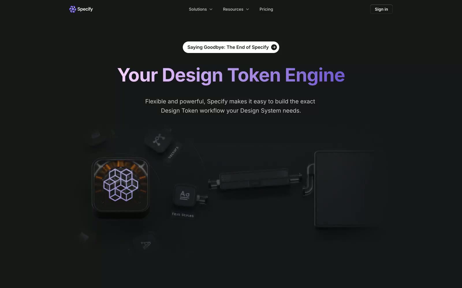
Specify
Specify — Style Reference
# Specify — Style Reference
> Black studio wall with neon violet sign
**Theme:** mixed
Specify operates as a dark-to-light narrative canvas: pitch-black hero sections with luminous violet gradient headlines command the top of the page, then flip to clean white surfaces for content and social proof. The visual identity is restrained SaaS geometry — compact 8px-grid spacing, Inter at every weight, subtle dual-layer shadows — with one signal breaking the monochrome: a vivid violet (#624de3) that lives inside text, icon strokes, and a handful of accent fills. Buttons are squat pills (40px radius) rather than the more common 6px chamfer; cards are 16px-rounded; the overall feel is dense, confident, and slightly editorial. The brand voice reads as engineer-adjacent: a product page for people who build design systems, not people who buy them.
## Tokens — Colors
| Name | Value | Token | Role |
|------|-------|-------|------|
| Iris | `#624de3` | `--color-iris` | Primary brand color — gradient headline text, icon strokes, accent borders, focal links. The only chromatic voice in the system; appears sparingly to make accents feel like punctuation rather than decoration |
| Soft Iris | `#8d4af7` | `--color-soft-iris` | Gradient tail for the brand violet — the lighter stop in hero headline gradients. Paired with #1d58c0 and #009639 only inside the carousel card color-blocks, not in chrome |
| Studio Slate | `#1a1d1e` | `--color-studio-slate` | Primary text, dark filled buttons, body borders, heading strokes. The working near-black that carries 90% of the interface's weight |
| Obsidian | `#151718` | `--color-obsidian` | Hero and section background fill — the deep dark behind the gradient headline and 3D illustration. Slightly cooler/lighter than pure black to keep the violet legible |
Websites
Markdown Text
design-md
website-prompt
landing-page-prompt
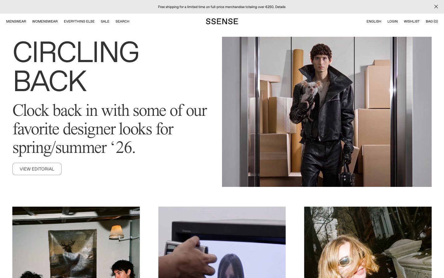
Ssense
Ssense — Style Reference
# Ssense — Style Reference
> White gallery wall with editorial serifs. A high-fashion magazine spread rendered as a single-page web experience — where the only color is photography and the only weight is restraint.
**Theme:** light
SSENSE operates as a digital fashion editorial: pristine white canvas, razor-thin sans-serif navigation, and oversized serif headlines that behave like magazine cover titles rather than web UI. The visual system is deliberately monochrome — no accent colors, no filled CTAs, no decorative gradients — letting editorial photography and typography do all the expressive work. Hierarchy is achieved through extreme scale contrast (95px display down to 11px meta labels) and tight negative letter-spacing on serif faces that pulls letterforms into elegant, compressed shapes. Components are minimal and ghost-like: outlined buttons, hairline borders, near-invisible dividers. The site reads less like a store and more like a curated print publication that happens to sell things.
## Tokens — Colors
| Name | Value | Token | Role |
|------|-------|-------|------|
| Obsidian | `#000000` | `--color-obsidian` | Primary text, navigation links, logo wordmark, footer links, SVG icon strokes — the anchor color of the entire system |
| Graphite | `#333333` | `--color-graphite` | Body text and headings — slightly softer than pure black for long-form editorial readability at large sizes |
| Silver | `#979797` | `--color-silver` | Hairline borders, dividers, inactive UI separators, secondary meta labels |
| Ash | `#888888` | `--color-ash` | Muted helper text, list items, tertiary metadata, subdued navigation states |
Websites
Markdown Text
design-md
website-prompt
landing-page-prompt
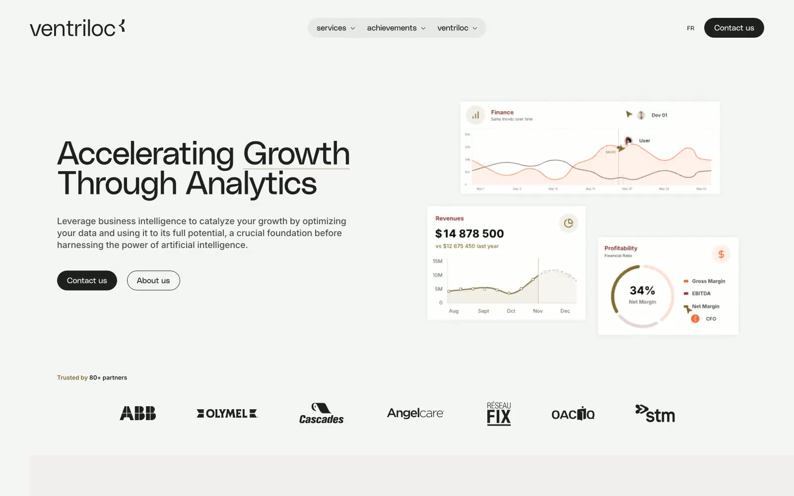
Ventriloc
Ventriloc — Style Reference
# Ventriloc — Style Reference
> analytics console on parchment
**Theme:** light
Ventriloc speaks in a quiet, professional whisper against an off-white canvas — a workspace where data feels approachable rather than intimidating. The interface is built on tight geometric type (PolySans) paired with Inter for UI, an almost-monochrome neutral palette, and a single warm orange (#ff682c) that punctuates charts, icons, and logo marks with restrained energy. Surfaces are flat and lightly tinted (white cards on warm-gray canvas), corners are soft (8px cards, pill-shaped controls), and elevation comes from gentle background shifts rather than shadows. Buttons are pill-shaped, nav is a floating rounded capsule, and dashboard mockups are presented as pristine white cards — the whole experience reads as analytical, airy, and deliberately unfussy.
## Tokens — Colors
| Name | Value | Token | Role |
|------|-------|-------|------|
| Signal Orange | `#ff682c` | `--color-signal-orange` | Brand accent — chart fills, logo swoosh, active indicators, small highlights; the single chromatic spark across an otherwise monochrome system |
| Sienna Bronze | `#816729` | `--color-sienna-bronze` | Muted brand tone — icon strokes, decorative chart elements, secondary brand marks where a subtler warmth is needed than Signal Orange |
| Carbon | `#202020` | `--color-carbon` | Neutral form states, badge text, and quiet UI feedback where color should stay understated. Do not promote it to the primary CTA color |
| Graphite | `#4d4d4d` | `--color-graphite` | Secondary text, body emphasis, subdued borders |